A Key Performance Indicator has limited value unless it can be compared to something. There may be some value as a record of change over time; however, unless it is known what sort of change is required, even this has little value. A KPI without a comparator can be used to help stabilise performance. For example, with a new process it is often the case actual values will vary wildly month on month until a process is bedded in. We may not know what a valid variance should be but simply recording the values will eventually provide enough data to generate an upper limit and a lower limit. So eventually, even a KPI without a comparator will create values to be compared to! These limits will become ‘thresholds’.
Thresholds are frequently based on targets. This can be an area of contention in business performance management circles. Targets are often set using arbitrary methods or justified using unhelpful interpretations of data. However, targets can be helpful when starting the process of defining thresholds. The key point about any target is that it needs to be reasonable and achievable.
Targets and thresholds are well understood when looking at financial measures. We often look at a ‘variance’ (threshold) to an expected result (target). For example, if expected monthly revenue was £325k and the actual revenue recorded was £309k the variance would be -£16k. This may or may not be a cause for concern depending on what was considered an acceptable variation to the target. For a KPI to be useful we need to clearly state both the acceptable and unacceptable results, that is, the ‘thresholds’. There are several threshold models; for the purpose of illustration we will start with the most common: Red, Amber, Green (RAG). In the RAG model there are two threshold points:
- When the KPI should turn Green
- When the KPI should turn Red
There are no hard and fast rules to the meanings attributed to each of the coloured areas but in general it is as follows:
- Green – an acceptable result, we are on target
- Amber – there may be a problem, we should investigate
- Red – an unacceptable result, there is a problem that needs rectification
By using an example for instance “Customer Satisfaction” we can illustrate using the following threshold values:
- Green – 95%
- Red – 85%
When these KPIs together with thresholds are entered into a performance management system the result might look like this:
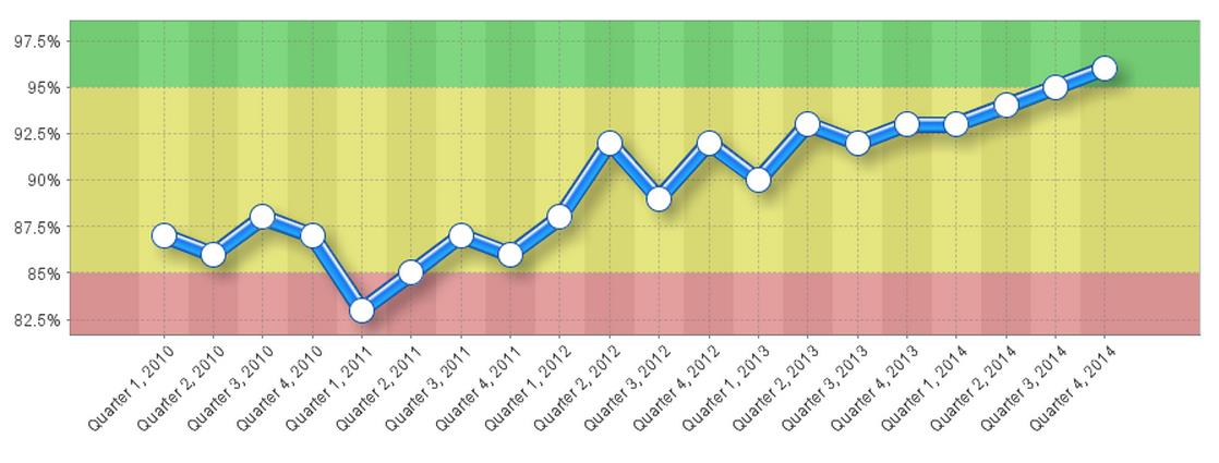
As can be seen, by setting threshold values the viewer can instantly and very graphically see the current situation and more importantly the history leading to this point. History provides a context to better understand the performance of the KPI.
Out of the numerous threshold models there are two more that should be looked at. The first is a simple extension of the RAG model, the second a variant that accommodates measures that are not linear in nature.
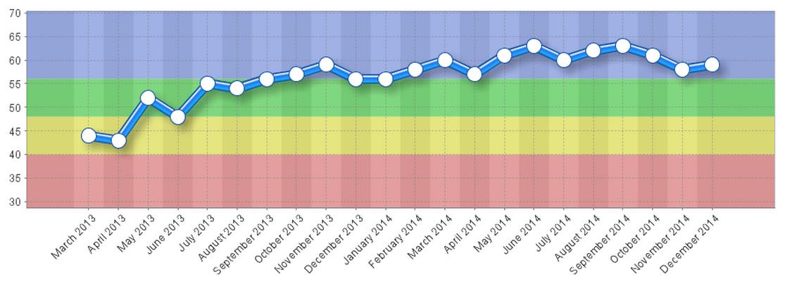
Often there is a need to get a better understanding of an ‘over-achieved’ status. This is particularly true in the area of sales and client management. Sales bonuses may be based on not only achieving a target but over-achieving it as well. It may be desirable to over-achieve in client management engagement where non-sales time spent with a client is deemed to be a positive activity. In this case an extension of the RAG model can be used; the Red, Amber, Green, Blue variant. For RAGB it is normal to set five thresholds:
- The lowest acceptable result
- When the KPI should turn Red
- When the KPI should turn Green
- When the KPI should turn Blue
- The highest acceptable (or capped) result
Using this type of threshold model, a pre-determined over-achieved status can be monitored and managed. Using the example of client engagement management looking at a KPI of ‘Average hour’s client engagement per month’, the result might look something like this:
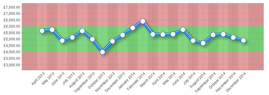
The third threshold example is the ‘stabilise’ KPI. Occasionally KPIs are deemed unacceptable if the result is either too high or too low. A good example is a training budget. In training we want to spend to the budget but not exceed or go below the budget. In this case we define what the ‘best’ result is and then determine acceptable and non-acceptable results below and above best. Using the example of a training budget, the result might look like this:
One of the by-products of defining thresholds is the ability to turn the KPI into a relative score. In the three examples above, the first was a percentage, the second was a number (hours) and the third a currency. Each had defined thresholds. A performance management system can take this information and create a calculation to ‘normalise’ the data and then turn it into a common score, for example between 1-10. With a normalised score, the scores across the system can be rolled up to higher levels.
The normalised scores can then be averaged by the system and an Objective score presented. This in turn could be rolled up with other Objectives to a Group or Perspective score, which in turn could be rolled up to department or company score. To illustrate this point, the following chart shows the combined normalised scores for the KPIs above in the form of the Objective ‘Improve Customer Satisfaction:
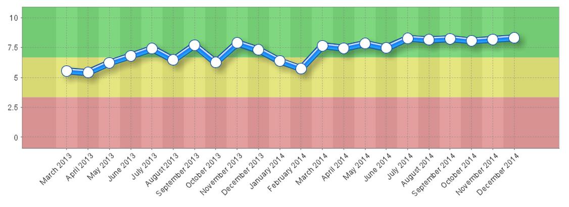
Note: the charts above were created using QuickScore.