How many pieces of information can you deal with at any given time? It doesn’t matter if you are Bernstein or Einstein there is a limit to the number of things you can do simultaneously. We all like to think that we can multi-task and get more done. The reality is, without exception, we all work on one thing at a time. The more have on our plate, the shorter amounts of time we dedicate to any single item. This is something that every CEO needs to know. Firstly to be aware of the strain this puts on an organisation and secondly to better understand how to manage key information when it is presented.
There are three simple questions a CEO needs to ask:
- What do I need to know?
- Who needs to tell me?
- How often do I need it?
Typically, a CEO will manage an organisation through a set of review meetings. The review meetings will usually take place every month. The people attending the reviews always want to tell their story. They want to be seen and heard and will inevitably go into great detail if allowed. A good CEO will manage this situation and get the balance right between receiving relevant information and allowing the presenter enough time to impress. However, these meetings take a long time and they often do not focus on the right things. What the CEO really needs is a mechanism that provides the facts in a easily digestible format that throws a focus on the things that really matter.
This is where a CEO Strategy Map really comes into its own. If created correctly, a CEO Strategy Map will consist of around twelve items separated into four major areas.This means for any given area of the business, the CEO only needs to look at a maximum of three things. A number small enough to allow full focus on every item. Better still, if the Strategy Map is part of a management system (it should be) the items listed will be coloured with a red/amber/green status. Therefore focus can be given to the areas that need it and the rest left alone.
The following diagram is an example of a Strategy Map for a telecommunications company
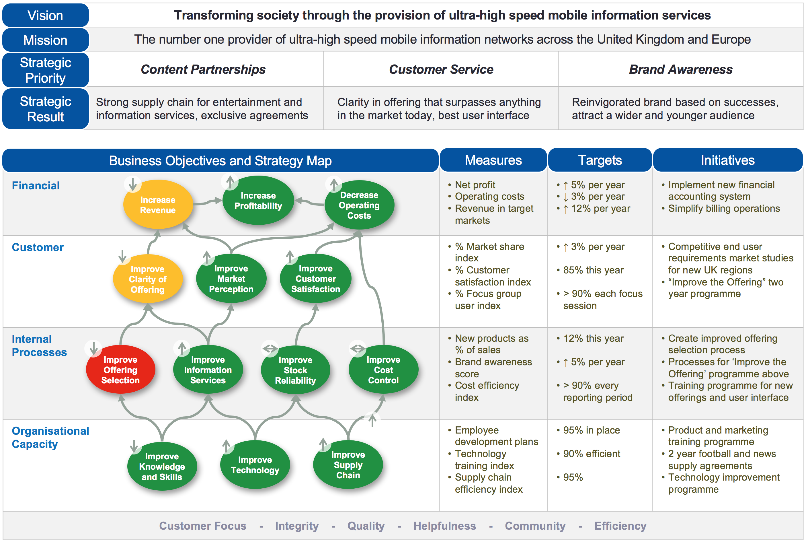
The key to ensuring this works is the data that resides under the Strategy Map. For every objective on the map there will be a set of measures. These measures have to be created with great care and attention. At the CEO level, each measure truly is a Key Performance Indicator (KPI) and more often than not will be derived from several other measures and presented in the form of an index. For example, the Customer Satisfaction Index is derived from a variety of both external measures (what the customer thinks) and internal measures (how well we are performing).
In this way, the CEO gets to see an amalgam of critical measures presented in a way that reflects the performance of the business as related to a set of business objectives. In larger companies or organisations there would be a top level corporate Strategy Map and several departmental Strategy Maps aligned to the corporate view.
You might have noticed the ‘trend’ arrows in the diagram above. These are vitally important. It is essential that decisions are NOT made on snap-shot information. For any anomaly the supporting tend data needs to be looked at. That is, the last few months history of the supporting measures/initiatives. In the case above it would seem obvious to look at the red item “Improve Offering Selection”. This needs to be done, but we can also see from the trend arrows that the measurements supporting the green objective “Improve Knowledge and Skills” are declining. This will almost certainly be a contributing factor to the red and amber items above it.
For more information on the CEO Strategy Map take a look at our white paper – How to create meaningful KPIs