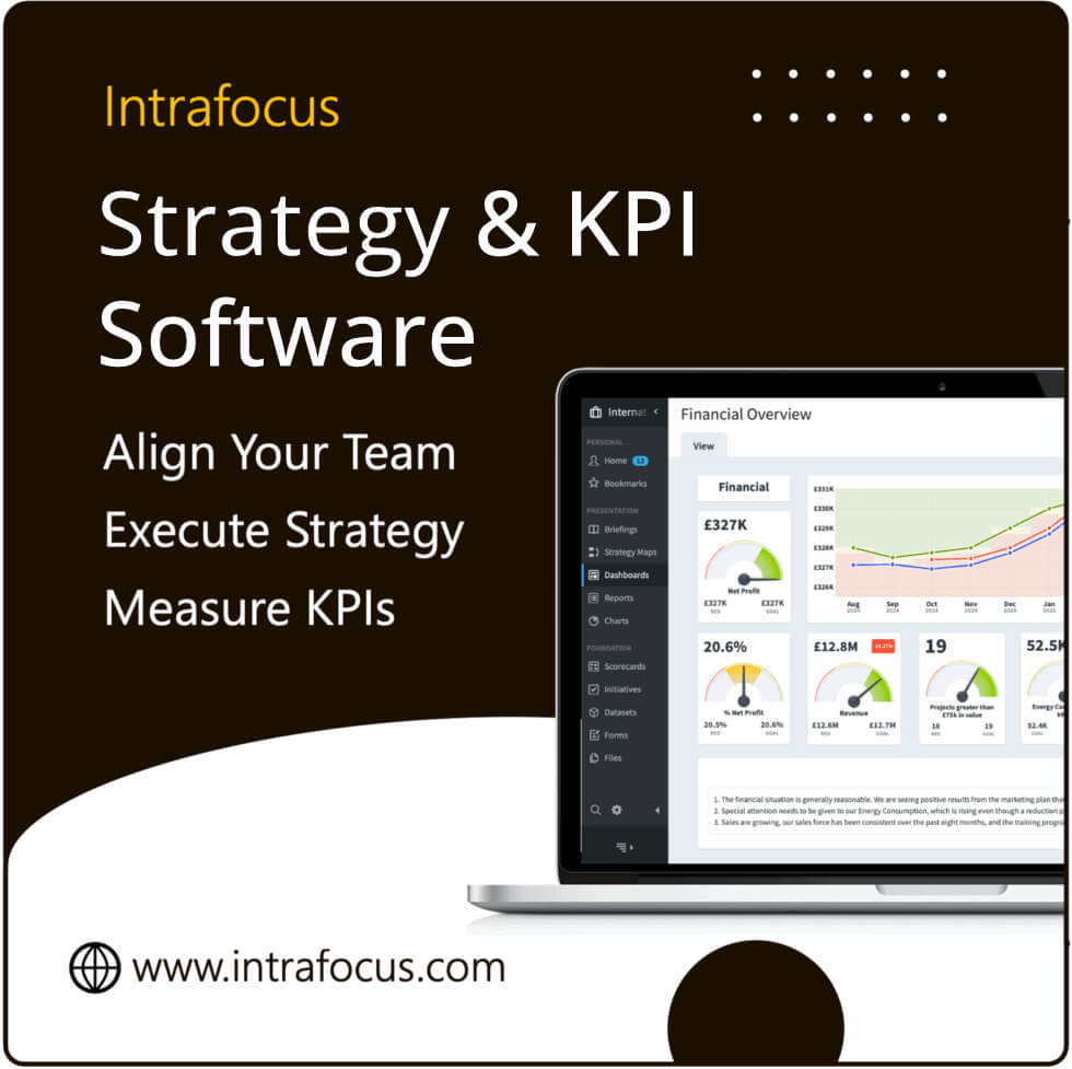
Creating dashboards
This article about creating dashboards uses examples for QuickScore. A quick reminder: QuickScore and Scoreboard are basically the same application. They run on the same codebase. The only difference is the terms used in the menus. QuickScore uses the Balanced Scorecard terminology so you will see words like Perspective and Measure. Scoreboard uses a generic business language, so you will see terms like Key Performance Area and KPI.
What makes a good dashboard?
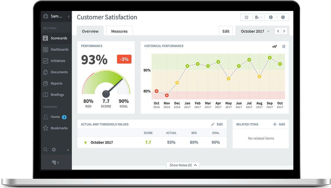
Where a scorecard will provide information about Measures or KPIs, a good dashboard will bring together multiple business performance elements and present them in context. It is the context that turns data into information. A good dashboard will not burden the viewer with too many clever gauges, dial, charts or other visual instruments. However, it will turn confusing row and column spreadsheet numbers into easy-to-read bundles of useful information. Typically a dashboard will provide an overview of an organisation’s performance or concentrate one a functional or departmental area.
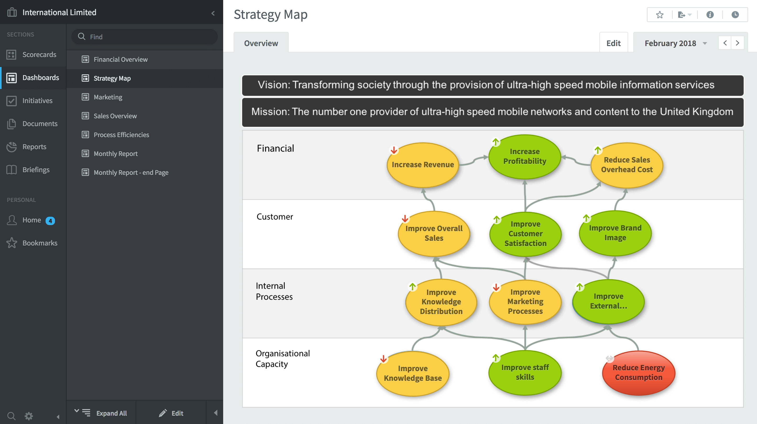
In this example, a company is represented by a Strategy Map that consists of a set of related strategic objectives. Each of the objectives is underpinned by a set of Measures/KPIs. The Measures/KPIs can be reached by clicking on the strategic objective bubble. In this example, you might click on the Red objective to see where the actual problem is occurring.
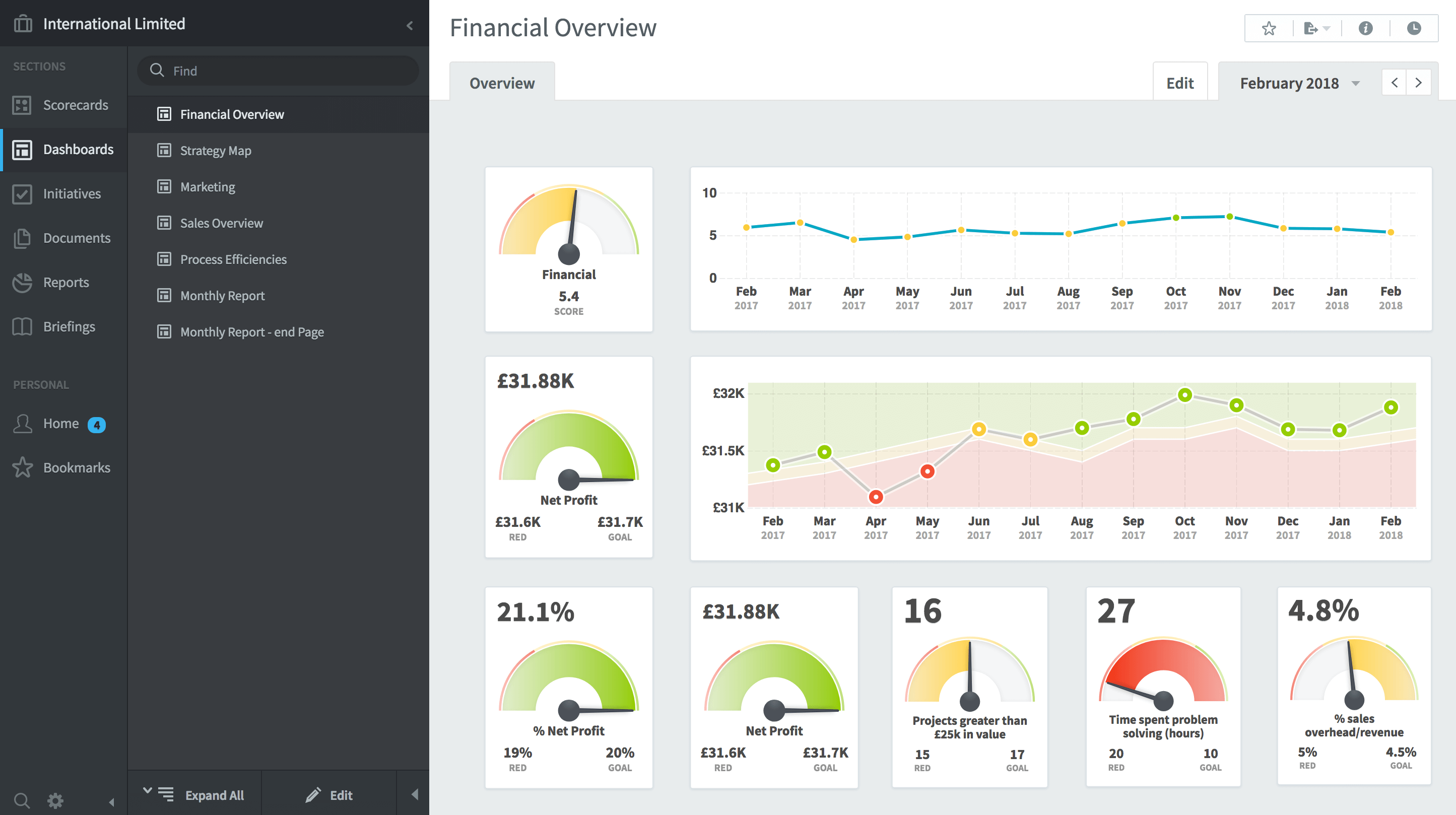
A more typical dashboard view would come from the financial area. In the example below, we can see a set of gauges which provide a snapshot in time, and more importantly, some line charts that provide historical information leading to the snapshot. In the centre, we can see the line chart includes red, green and amber thresholds associated with the KPI Net Profit. Typically, a financial KPI will have thresholds that vary every month as they are aligned to a budget or a forecast.
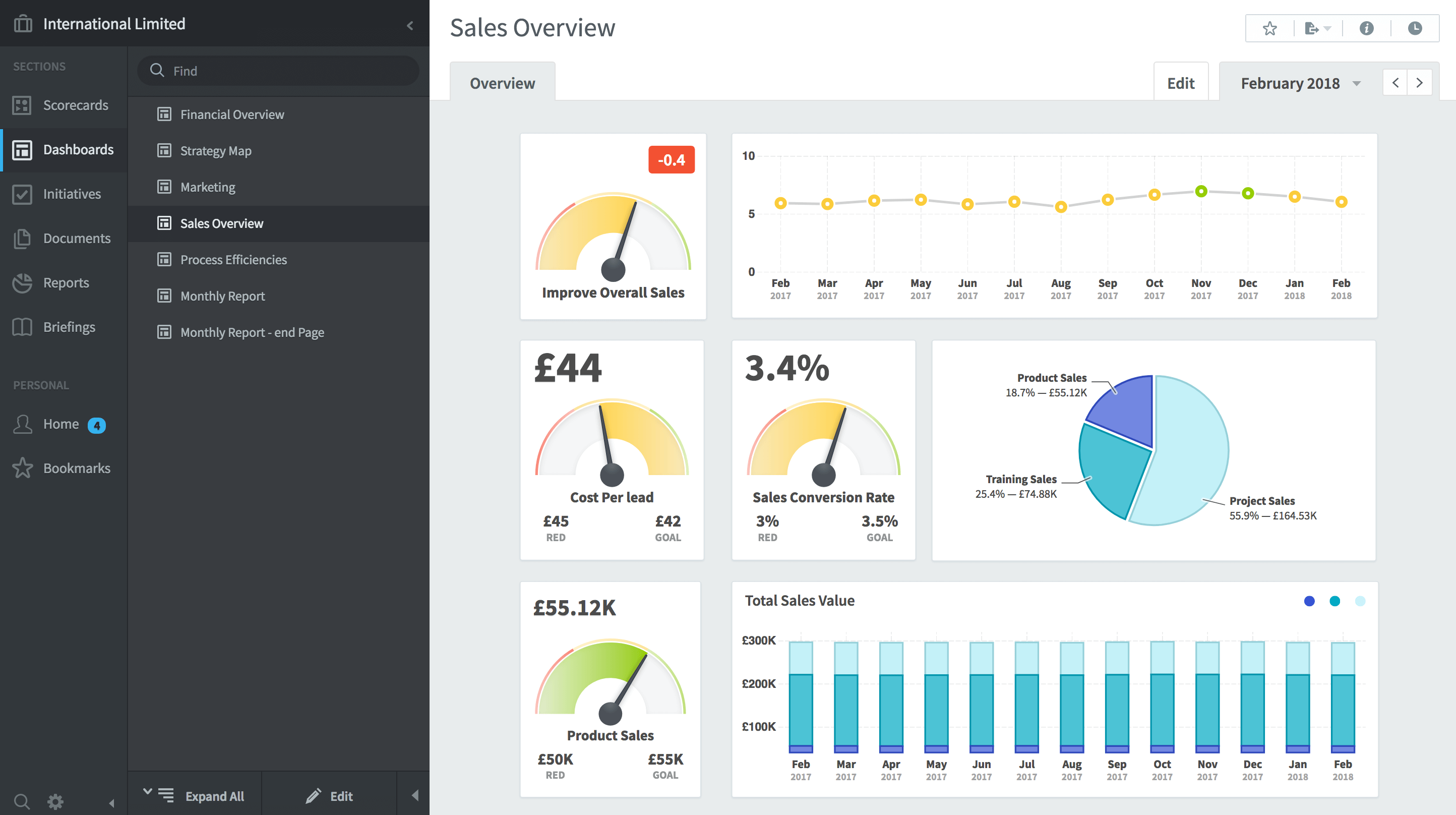
It is important to remember that less-is-more when thinking about dashboard design. There is always a temptation to add too much information. The result, inevitably, is that nothing stands out and you might just as well be looking at spreadsheet data. Careful design ensures that the appropriate objects are used, and the information provided is useful. In the following sales dashboard example, a pie-chart has been added as this provides a useful insight into sales.
Dashboards should provide useful information upon which decisions can be made. A poor dashboard can have completely the opposite effect, that is, they leave the user confused and bewildered. Here are six things that a dashboard should not do:
- Exceed the boundaries of a single screen.
- Supply inadequate context for the data
- Choose inappropriate display media
- Ineffectively highlight what’s important
- Clutter with useless decoration
- Misuse or overuse colour
With QuickScore and Scoreboard, dashboards can be quickly and easily created using the dashboard design module. The ‘widgets’ available have been designed to be consistent in colour and attribute. This means, although there may not be a huge number of objects to choose from, you can guarantee all of your dashboards will look great and will not fall foul of the rules above.
If you would like more information about QuickScore or Scoreboard or how to create an informative dashboard, please be sure to visit other areas of this website.