
What Makes a Great Dashboard?
In this article series, we are going to look at the value and use of business performance dashboards. These are typically presented to managers in end-of-month reports. In the first article, we will look at the elements of a good dashboard and the use of automated software tools. We will then go on to discuss common mistakes and best practice tips in the rest of the short series.
What are we talking about, exactly?
A great dashboard is a monthly visual report that provides a snapshot and history of the organisation’s performance overall, with accompanying dashboards or sectional views for individual departments and functional areas. Any manager will be familiar with the concept of monthly business reports, and the dashboard approach simplifies them and makes them easier to read.
So, let’s now look at the elements of a great dashboard.
What makes a great dashboard?
We have talked previously about the Balanced Scorecard methodology, which provides information about business performance measures and KPIs. The business performance dashboard gathers together this broad set of business performance markers and presents them visually and intuitively within their context. This attribute of context is the key to success, with the dashboard transforming raw data into user-friendly information that is easy to assess, digest and analyse.
Crucially, a good dashboard relies on simplicity. It will not resort to a confusing mix of front-page charts, dials, gauges, barometers and other visual presentation methods. After all, its purpose is to flag up key outcomes and trends to aid good management decision-making.
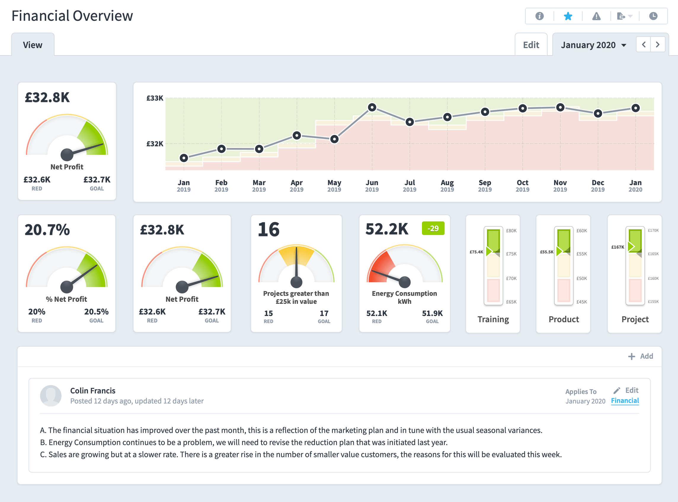
The dashboard below can be rendered directly from a QuickScore system. One of the benefits of using a dashboarding system or KPI software is the ability to display dashboards on the internet, intranet or local TV screens.
How are dashboards created?
Modern business information software tools such as QuickScore and Scoreboard largely automate the process. Using intuitive interfaces, they allow dashboards to be easily created and then populated in real-time with the ability to interrogate data and to drill-down to areas of interest. They provide instant trend data and flag up concerns using visual keys such as the RAG approach (Red, Amber, Green) that is used commonly in most organisations.
A great business performance dashboard must:
- Visually illustrate key business performance data and KPIs in a single screen
- Allow users to rapidly find the information that they want, in-display media that suit their preferences (for example, different types of graph or chart, with accompanying commentary.)
- Provide a rapid snapshot of what is happening across the business, with the option to drill further down into KPIs and performance by business area.
- Present appropriate display media (for example, financial dashboards often have line graphs and sales dashboards often feature pie charts.)
- Clearly highlight key points and areas of focus (for example, with the RAG key and with links to commentary as required.)
- Be visually simple and consistent, without clutter or confusing use of colour.
How can businesses build a great dashboard?
Every business will choose its own approach to building a dashboard according to its managers’ needs. However, some consistencies will always apply:
Real-time or near-time data?
A tool such as QuickScore or Scoreboard means that hard copy and static reports no longer have to be printed out for monthly packs. Instead, links can be distributed allowing managers to see the very latest data and insights. For KPI reports organisations would typically report weekly, monthly or quarterly. In some industries, real-time data refers to up-to-the-second data. For example, in manufacturing, there are some assembly line processes that are monitored in real-time’. That is not what we are discussing here. That is an operational measure, not a Key Performance Measure (KPI). KPIs are used to monitor the ‘health’ of a business or organisation. For this, we would measure near-time data.
API integration
By integrating with existing business data systems using an intelligent API, these software packages automatically read and present data, pulling it into the dashboard. This minimises time and resource requirements – remember ‘pre-tech’ when creating the monthly manager’s pack was a vastly time-consuming exercise in itself? The intuitive drag and drop interface means that the system administrator can adjust the dashboard at a moment’s notice according to needs, and cloud-based hosting offers a range of benefits, such as affordability, data security and remote software upgrades over time.
Design
QuickScore and Scoreboard also provide their own intuitive dashboard design module, with widgets that are easy to choose and place for the quick and intelligent creation of a perfect information view. The software uses consistent colours and design attributes so that every dashboard will look clean, provide the necessary information in the right way and allow your business leaders to get an accurate picture of the business at the touch of a button.
In short, these modern software systems make the creation of rich and informative business performance dashboards easier than ever – giving your leaders the tools that they need to make confident, data-driven and meaningful business decisions.