

Building a dashboard
Building a Dashboard – In this short series of articles, we have explored the topic of business performance and looked at the dashboard approach to delivering management information for decision-making. We also looked at some of the common errors made when creating a dashboard. So now as a summary of the material we have covered so far, we turn our attention to top tips for getting it right the first time!
Involve the right people
Everyone will have a view on a new business performance dashboard, so keep your internal consultants to a minimum. At the development stage, take input from stakeholders who need to read the dashboard and derive information from it for management decision-making. With other stakeholders, seek to inform them of the purpose and value of the dashboard, without gaining more input. It can be a classic case of too many cooks spoiling the broth otherwise!
Use a software package
Forget creating laborious manual systems or Excel-generated charts and graphs. Modern dashboard creation software such as QuickScore and Scoreboard make the process easy. With these systems, you can choose pre-defined widgets and draw in existing sources of business data to automatically populate a ‘drag and drop’ dashboard design. When you want to make changes, this is easy to do as well, allowing your dashboard to evolve fluidly over time.
Limit your dashboard information
Remember, business performance dashboards exist to transform raw data into usable information that is easy to digest and to understand. So, don’t make the mistake of trying to show endless KPIs and measures which will confuse readers. Make sure the chosen measures all fit on one screen view.
Choose high-level measures
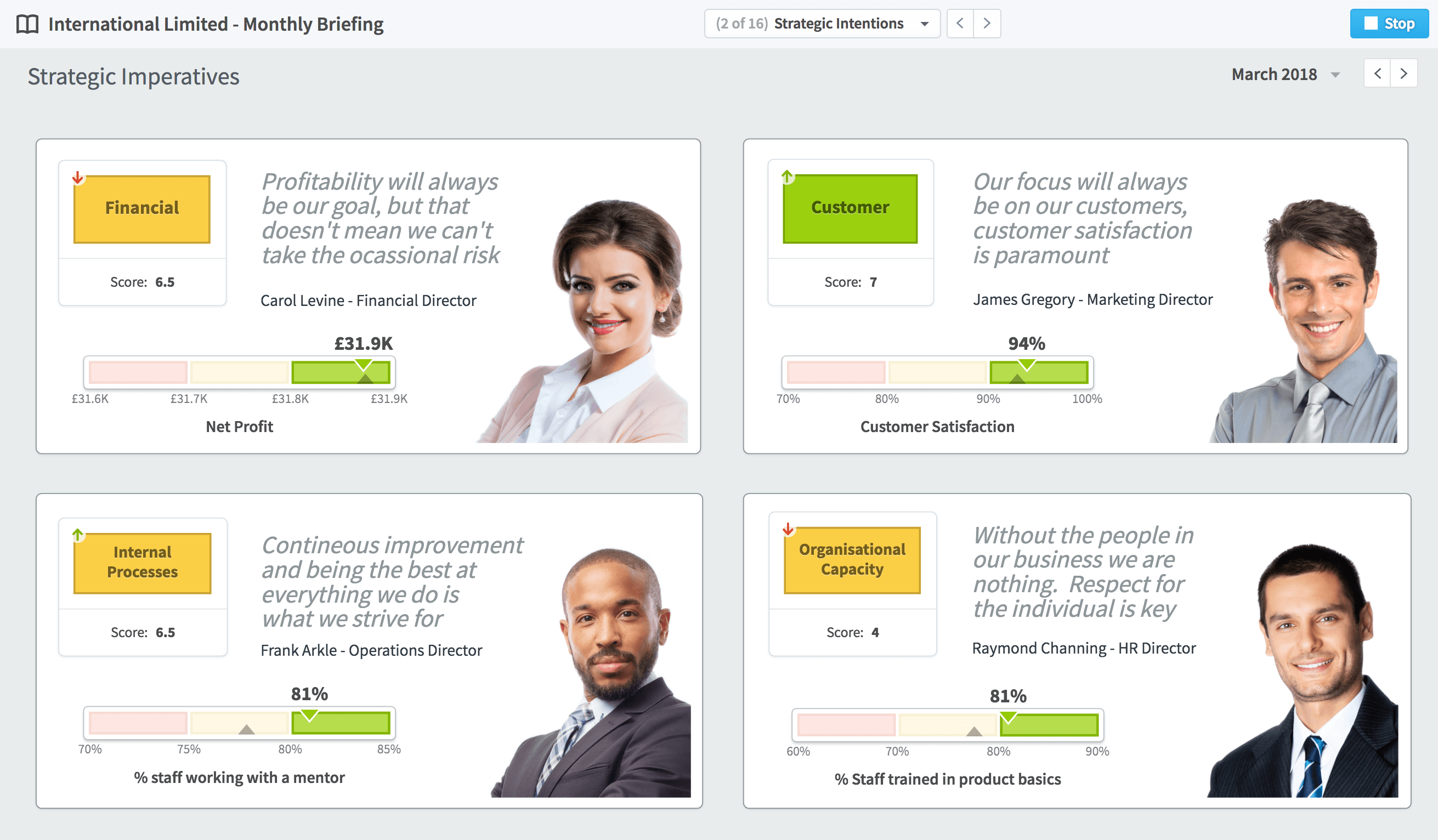
Again, refer to the absolute purpose of the dashboard and ensure that the design widgets you show only feature necessary information. Supplementary data and insights can be provided as supporting information where required, but don’t risk confusing readers with layers of data or superfluous extras. Allow the dashboard to provide a snapshot and then ensure that the overall report contains supplementary commentary and insight as necessary. Do not be afraid to include information about who is directly responsible and accountable for the information being provided. In the example below, it is clear who is driving the way forward!
Pick the right widgets
Don’t go overboard with different types of design presentation. Too many complex graphs and charts can become overwhelming. QuickScore and Scoreboard make this easy by offering the most popular and valuable type of design widget in an easy ‘drag and drop’ format, using ready-made templates that work well from a visual and functional perspective.
Speak to IT
When you buy a software package such as QuickScore or Scorecard, it will make building a dashboard easy, but it requires an API setup to link with the right internal databases on a read-only basis. This will allow the latest business data to be drawn into the dashboard in real-time. Liaise with IT so that they are informed of the project’s timescales and understand what work they may need to do.
Go easy on colour
In a dashboard context, colour should be consistent and have a meaning. For example, use the RAG system of red, amber and green to denote progress and to flag up areas of focus, but don’t add competing colours. To denote sections and to create contrast, use grayscale. The QuickScore and Scoreboard software packages provide ready-made designed templates and widgets that simplify this process.
Consider different dashboards
The dashboard approach can be used for different kinds of reporting – such project reports that show progress against objectives, functional area reports that show results against targets, budgets and other key operational data and balanced scorecard reports which might show the ongoing rollout of a change management programme.
Communicate
Make sure you communicate the dashboard’s existence across the business so that internal decision-makers become aware of it and understand its value.
Know that it may change over time
Your dashboard doesn’t have to be perfect from the start, especially when you use a system like QuickScore or Scoreboard, as it offers easy editing with an intuitive drag and drop interface and automatic data reading via an API. Trial a version and then refine it over time according to feedback.
Now that you have the knowledge you need when building a dashboard, why not take the first step to creating your own?