
Monthly Reporting: Two of the greatest productivity tools used in business today, large or small, are spreadsheets and PowerPoint presentations. Without doubt, these two desktop applications have changed the way we conduct business and have allowed us to analyse and present information in ways unimaginable before their arrival. It is not difficult to become a PowerPoint expert and with a little training, using spreadsheets to dissect and put back together data to generate useful information has become easier and easier. With these tools, we have all become data gurus. And therein lays a problem.
We are all so confident we can manipulate spreadsheets to obtain data and present it in all manner of colourful charts we go ahead and do just that. Month on month we undertake even more analysis and create brighter and more complex charts that look great. But do they give us what we actually need to run a business effectively? Sometimes. But this method of review is not optimal. A monthly review has to do a lot of things, but one of the most important things is to provide consistent reporting over a sustained time period.
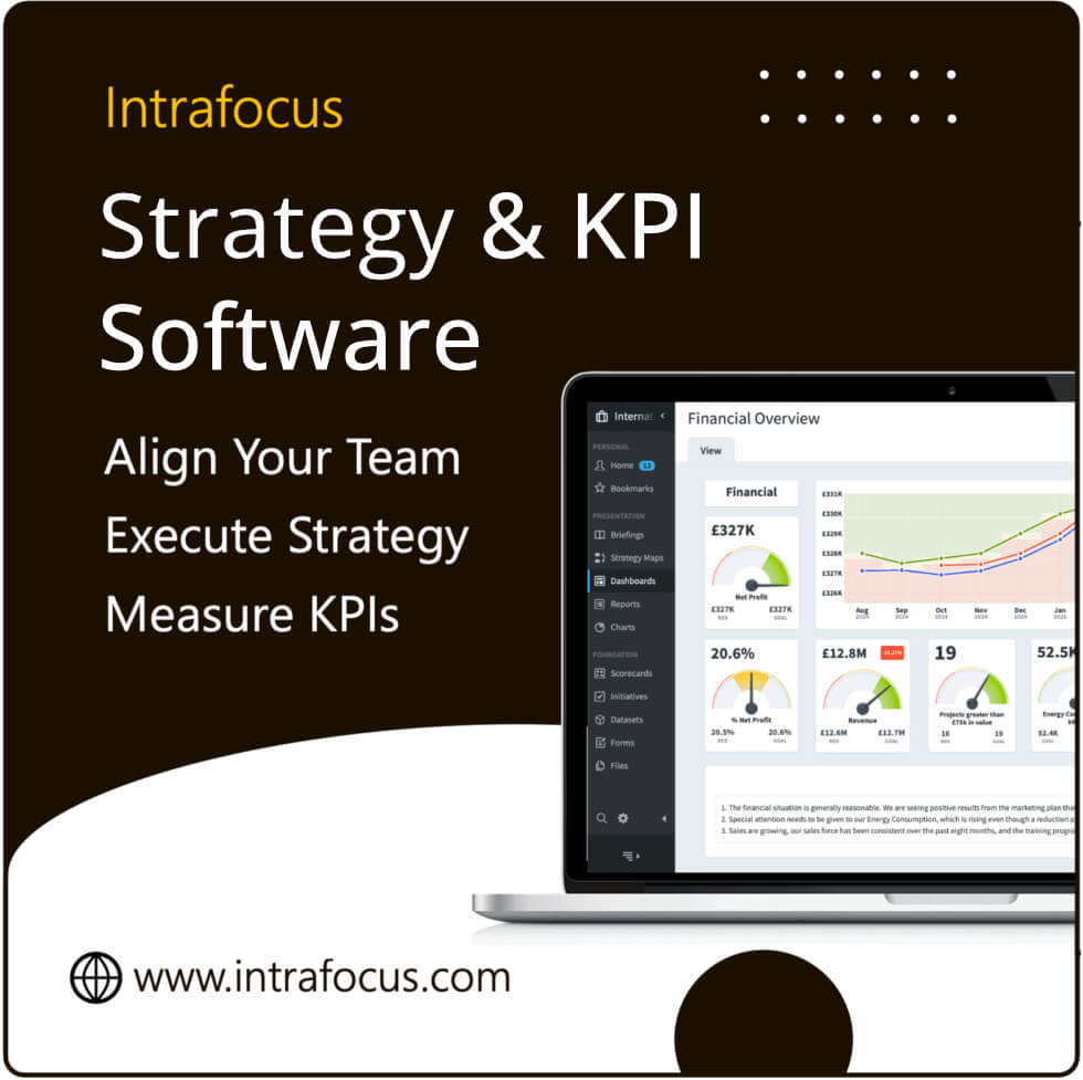
Consistent reporting means agreeing on a set of Key Performance Indicators (that contribute to business objectives) that are clearly defined, rated as important and have ownership. (See the last three Insight items for more information on developing successful KPIs). The information these KPIs provide must be delivered in a consistent format month on month. That format has to allow managers/leaders to quickly see if the business is performing to the required levels. This means that thresholds, i.e. what is good, bad and indifferent, have to be set ahead of time. By doing this a typical red/amber/green colour code can be added to give an instant visualisation of performance. The charts must be visual, but not overly complex and most importantly, they must be the same visuals every month.
A sustained time period means that the KPIs must remain the same over a long enough period to be able to judge a trend or observe a change. Therefore there is a need to see historical data as well as the current month’s results. Visually prepared historical data can be a very powerful tool to help determine a course of action. It will show an action may be required immediately for an anomaly and equally determine a course of non-action where an overall trend is rising even though there is a dip in a current month.
Clearly, there is a need to use all of the tools available to us to examine the business. PowerPoint and spreadsheets will always be very useful. These tools should be used in addition to a consistent and sensibly presented monthly reporting pack that can be generated using dedicated business performance tools like QuickScore.