
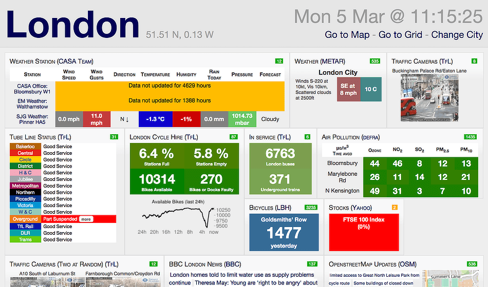
In the example above of a real dashboard – http://citydashboard.org/london/ we can see multiple common mistakes. First, there is far too much information; second, it is crowded; third some information is pulled from sources no longer available and so an error appears, and fourth, well this article will talk about some of the common mistakes you will find in dashboards.
Common Mistakes When Building KPI Dashboards
In this article series, we are looking at business performance dashboards as part of the regular reporting cycle carried out by businesses and organisations. We discussed what makes a great dashboard in our first article and now we turn our attention to common mistakes that are all too easily made when creating a business performance dashboard for the first time.
1. Trying to satisfy everyone
You simply can’t please everyone, and this is certainly the case when designing a business dashboard. Forget trying to achieve the impossible and remember that every user will have their own needs, preferences and goals. Focus instead on target user groups and obtain their specific needs. This will give you a clear set of objectives to work to. Remind stakeholders too that dashboards can be adjusted over time and that your own will no doubt evolve as it ‘beds in’.
2. Losing sight of the big picture
It’s all too easy to get lost in widgets and colours, especially when everyone thinks they are a back-seat designer! Instead, focus on the big picture of the dashboard and its strategic drivers. You must ask fundamental questions such as: What exactly is the dashboard trying to achieve? Who are the end-users and what are their needs? The big questions provide the foundation for the storyboard and its strategic intent. Get this in place first and you can create a goal-directed dashboard with a clear scope that defines its data limits.
3. Getting carried away with design features
Remember, it’s a dashboard not a piece of art! Designers often end up under pressure to add too many graphics and colours which confuse the end-user. Remember, colours must be minimal and meaningful – such as the RAG system of categorisation. If additional colour is needed, then link it to the brand. Graphics choices should be limited to the required information sets and kept clean and uncluttered. Software packages such as QuickScore make this stage easier by providing ready-made design widgets which can be dragged and dropped into a ready template for ease and speed.
4. Know what problems are being solved
Ask your dashboard user groups what they are trying to solve with their dashboard. This focuses on essential information and helps to remove any confusing ‘clutter’ or non-essential data sets.
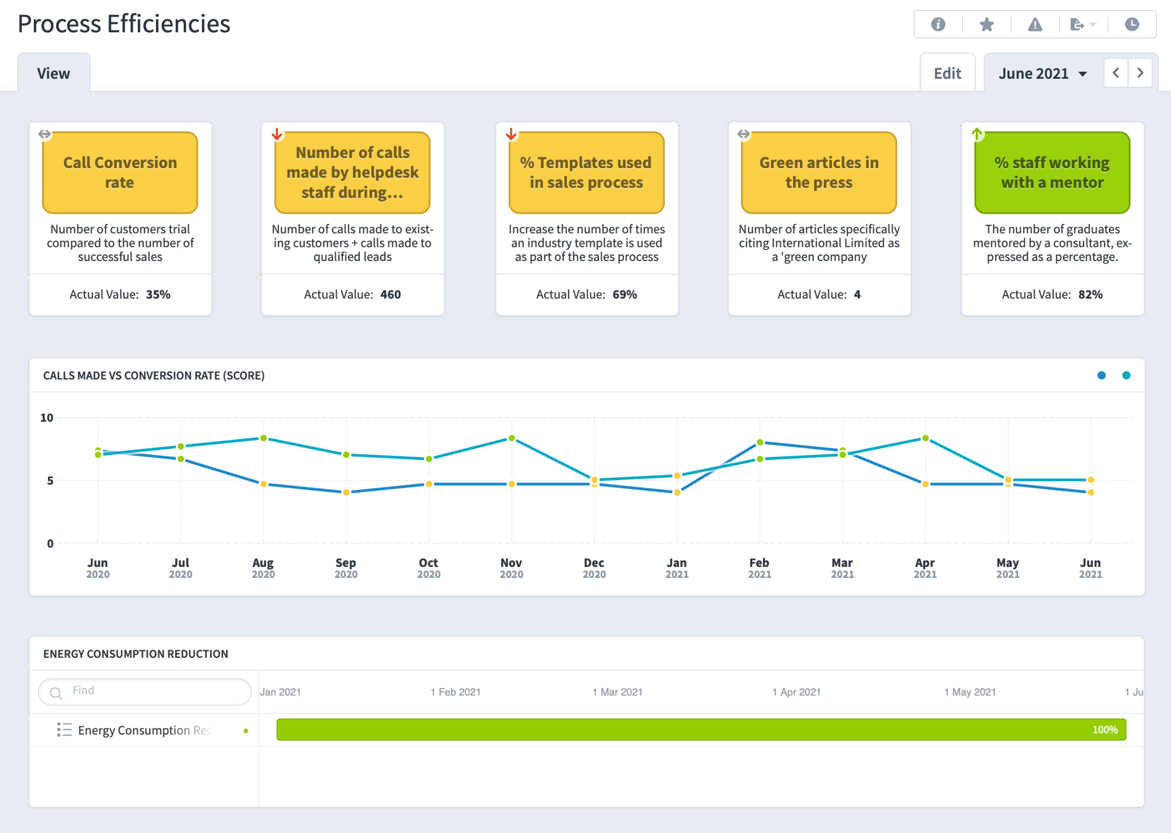
In the example below, a process improvement team wanted to see their key metrics and an overview of achievement over time.
5. Asking for data visualisation preferences
Never ask your business customers about their design preferences. Instead, discover what problem they are trying to solve with ‘their’ functional part of the dashboard and then reassure them that you will find the most appropriate graphical representation for their needs. You can show them suitable options from the QuickScore widget data presentation set if necessary, as it is purposefully limited to the most useful types of graphical representation.
6. Providing context-free data
The dashboard exists to provide context. Remember though that numbers will have varied meanings across different users. Find out what references your internal customers use to provide context to evaluate their numbers. For example, finance teams may want comparisons against the previous year, and sales may want competitor data.
7. Flagging up too many alerts
It’s all too easy to add coloured RAG alerts to dashboards in a bid to make them more actionable and insightful. But if too many alerts are present they will overwhelm and confuse readers. Remember, a manager doesn’t need a flag when a measure or KPI is doing slightly better or worse than average. The alerts should be triggered by defined, significant departures from acceptable performance levels and be linked to required action. If no action is needed – or available – then the alert isn’t required either.
8. Showing too much detail
A good dashboard will visually flag up what is important in a single screen view and facilitate abstract, high-level thinking by key decision-makers. Give end-users the most necessary information that they need in a first-glance view that is easy to absorb. A good rule of thumb is that if the detail being shown isn’t directly aiding the objective of your dashboard measure, then it is probably excessive. Remember, the dashboard is a snapshot and further information can be accessed by drilling down through the various report levels as required.
Avoid these common mistakes when building dashboards and you will be well on the way to creating user-friendly business performance dashboards that provide real management value. In the next article, we will go one step further and look at some usable best practice guidelines to get you started!