What is a KPI Dashboard?
KPI Dashboards have become a standard element of management reports. A KPI should never be used in isolation. KPIs should be grouped together to create a dashboard. A Key Performance Indicator (KPI) is a business measure. It provides evidence of the success, or failure, of a business objective. Thus providing a vital tool to measure progress. KPI Dashboards form part of a regular reporting pack for managers.
Get this right, and management becomes much more effective.
Typical KPI Dashboard (more examples below)
Get your KPIs in order
We know that a KPI is a performance measure that tracks progress towards strategic objectives and goals. To recap, KPIs can be used to measure the repeated success of operational goals, and they must be linked to strategic goals and objectives.
There will be KPIs for each department, but each will contribute towards the organisational strategy. Typically, organisations manage this process with a recognised management framework methodology such as the Balanced Scorecard.
What we need to remember in the context of this discussion, is that it’s vital to have the right KPIs in place before you start creating a dashboard. Focus on this as your priority and once you have your suite of core KPIs signed off, you can move ahead to defining their presentation for the monthly management pack.
What is a KPI dashboard?
Every business will have its own approach to designing a KPI dashboard. However, organisations that do this successfully will typically:
Get the correct people on-board – Remember that ‘too many cooks spoil the broth’ and simply involve stakeholders who will need to use the dashboard to aid their decisions. With systems like Scoreboard, no format need be set in stone, and you can easily adjust the dashboard over time as you get user feedback.
Keep the bigger picture in mind – Fancy dashboards may look exciting, but they can easily become confusing and off-putting. Instead, focus on what you are trying to achieve and don’t get distracted with all-singing, all-dancing artistic presentations!
Simplify the process with technology – Forget the laborious old days of creating manual data sets from Excel. Modern and browser-based software packages such as Scoreboard simplify and speed the process. Simply select your chosen widgets, set up APIs to draw in the necessary data and use intuitive ‘drag & drop’ interfaces to create rich and informative dashboards – without any hassle. Even better, Scoreboard can be used as an app to view on mobile devices, anywhere and any time – without any need to install any software.
Keep things simple – KPIs are designed to measure ‘key’ strategic outcomes. So keep your dashboard clean and simple so that decision-makers can focus on what’s important. Ideally, every measure should fit onto a user-friendly single-screen view as a ‘snapshot’ of progress. Provide a supplementary commentary in the report with details on individual responsibilities. This flags up who is accountable for progress, and gives readers a further point of contact for queries.
Provide context – Your front-level dashboard will provide a snapshot, but your internal customers may value context that helps them to evaluate the numbers more meaningfully. For example, marketing may want year-on-year campaign data and operational teams may want industry benchmarks.
Remember the principles of good design – It’s tempting to go overboard with colour but wise to use it sparingly and with purpose. As an example, the red, amber, green RAG system is recognised by all and a great way of flagging up progress. Use grayscale for contrast and pick graphs and displays that everyone can recognise. Scoreboard and Quickscore both make this easy with a host of ready-made drag and drop widgets and templates fro KPI dashboards.
Use more than one dashboard – The beauty of dashboards is that they are suitable for a variety of reporting needs. For example, a sales dashboard might report against operational figures, and another might show softer measures of an internal culture change programme. With your software in place, all dashboards become quick and easy to update and circulate when needed.
Don’t try to please everyone – Everyone has different learning styles, visual preferences and information needs. You’ll tie yourself in knots trying to satisfy them all! So instead, just focus on your target audience, begin as simply as possible and let your dashboard evolve over time and in response to actionable feedback.
Share it! – Your organisation’s decision-makers need to know about your dashboard – so tell them, and explain its value – offering training where necessary. The more you can share the progress of your business strategy across your business, the more likely you are to achieve success. Transparency supports success because employees feel more engaged and motivated to perform when they feel involved, consulted and respected.
Why can’t I just use a spreadsheet
Most managers within a business will be familiar with Excel and find it to be a hugely valuable tool. There is a temptation to use it to create manual spreadsheets, but the approach isn’t the one we’d recommend.
There are exceptions to the rule of course. For example, if your business is a start-up or just beginning in its strategic journey, it might prefer to take each stage of the learning journey slowly.
However, once you are in a position where you have clarified your reporting intentions and a schedule for doing so, Excel will rapidly fall short of what you need.
What are the main issues with spreadsheets for KPI reporting?
Errors – Excel uses multiple spreadsheets, and the action of copying and pasting data sets between then will invariably result in errors. Most companies will end up with large documents with multiple tabs. As data and additional KPIs are added over time, these tabs increase – along with the underlying errors. Once those errors creep in; particularly where functions are involved – it can be very difficult to trace the issue back to the source and fix it.
Time-consuming – Manual updating is extremely time-consuming. Pity the poor managers who are charged with removing old data, adding new data, creating charts, typing in commentary and checking for the accuracy of what they have done. Rather than managing their functions and actually helping the business to achieve its strategic goals, they get stuck in admin hell! Working with KPI dashboards should be interesting – and even enjoyable – as the results of the team’s efforts become visible. But grappling with a huge Excel spreadsheet easily makes the monthly KPI dashboard something to dread…
Lack of customisation options – Excel isn’t designed to be a visual system, and it is difficult to customise report formats. Yes, you can make your own custom graphics and charts within your KPI dashboards, but each one needs to be manually adjusted when a change is made. What you need is a system that offers flexible, high-impact templates that can be customised and repeated.
Version control – It’s surprising that so many businesses are still relying on spreadsheet programmes, which by their nature don’t offer automatic version control or collaboration tools. Attempt to create KPI dashboards in Excel and you run the risk of people adjusting information, saving out local versions and inadvertently adding in errors. Suddenly that review meeting becomes less about strategic discussion and more about attempting to locate the correct source document!
How to create the best KPI dashboard
Our step to step guide to creating the best KPI dashboard will take you from zero to hero fast! Your guiding principle is to view the dashboard as a snapshot of the business’s health; allowing it to tell a visual story in a way that helps your leaders to make decisions.
- Pick the right KPIs, deciding whether you want the dashboard to be primarily for informational purposes, or to drive employee behaviours. Consider the audience too. Your senior leaders will want to see high-level financials, whereas functional managers will be interested in operational measures.
- Choose how many charts you want to present, allowing for 5-15. The fewer you can present without losing essential information, the better for readability and analysis.
- Pick the charts and graphical presentations which you think will best suit your audience.
- Add RAG statuses within each KPI’s threshold, to immediately flag up areas of attention, and add trend data where it provides value.
- Provide explanatory text and commentary where needed, recognising that figures often require a supporting explanation, especially where they seem to suddenly show a significant change or adverse result. This will help to accelerate discussion during the review meeting too, as attendees will have the context and background, and can move forward to a productive debate.
- Review the visual appearance of the draft dashboard, and make sure it looks attractive. With a system such as Quickscore, you can customise the report in your corporate brand colours and adjust the layout so that it has plenty of negative space (essential for easy reading) and looks great!
Sharing your KPI dashboard
When you circulate the KPI dashboard, remember that the system will allow updates to be made in real-time. When your recipients click into the dashboard, they will be seeing the latest, most accurate data sets and can add their own comments with clear version control. Explain that the dashboard is a working draft which can be reviewed over time, and invite constructive feedback that helps to further improve and evolve its presentation as the process beds in.
The importance of KPI software
Scoreboard is a software package that makes it quick, easy and intuitive to create professional dashboards for management reporting. From drag & drop widget functionality and API integration to automatically pull business data to populate reports in real-time, Scoreboard allows organisations to raise their game with impactful KPI dashboards.
Use it to create tailored reports, presentations, task lists and scorecards too. It works for organisations of all kinds and all sizes, and we are pleased to offer a free and no-obligation 30-day trial of Spider Impact.
Learn: KPI Software
Developing KPIs
Before you start thinking about a KPI Dashboard you will need to get your Key Performance Indicators sorted out. Download the free e-book today.
Developing Meaningful KPIs takes you through a simple but tried and tested process of developing the KPIs that you really need. Read our guide.
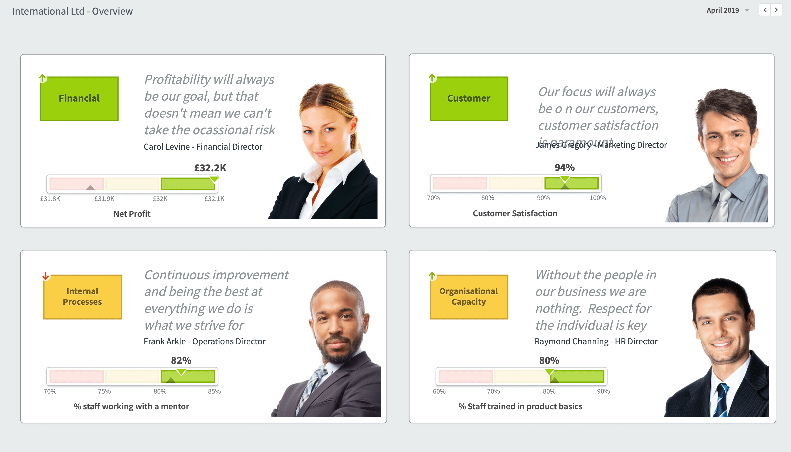
Sample KPI Dashboards
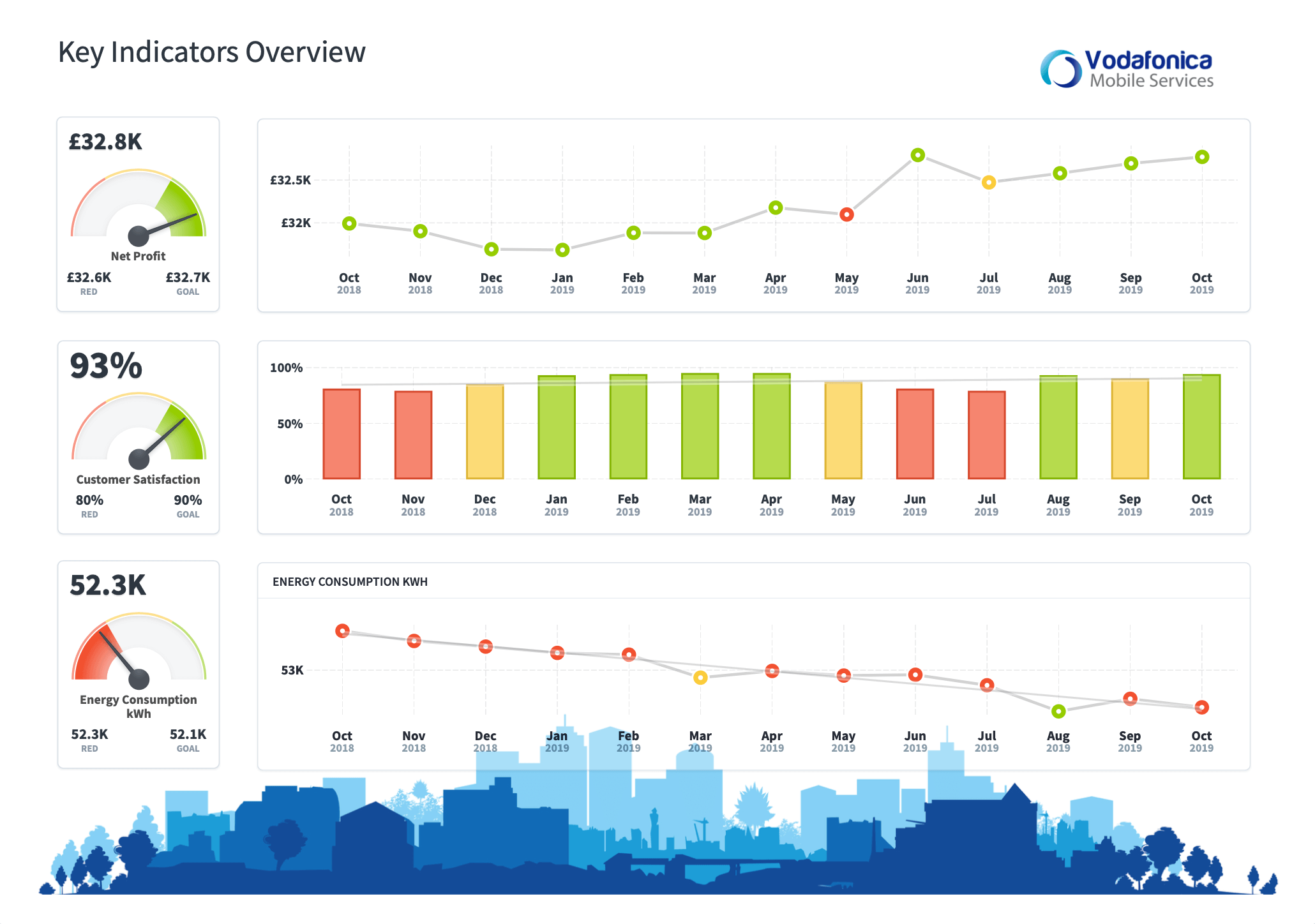
The following dashboards are from a demonstration system. Spider Impact has a ‘shared dashboard’ function where dashboards can be displayed to viewers. The viewers do not need to sign into the application.
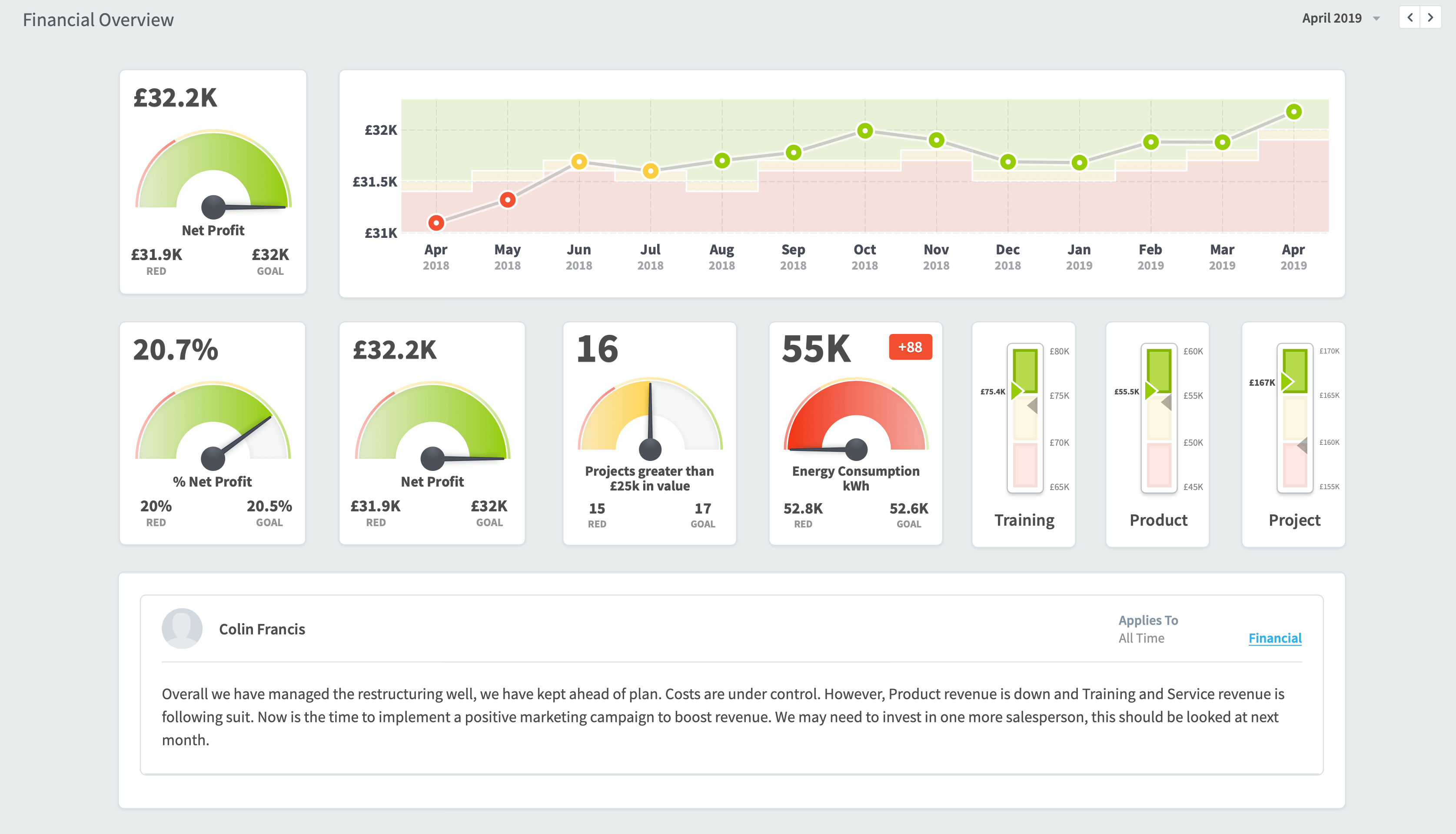
This second example looks at financial information, notice how comments can be added.
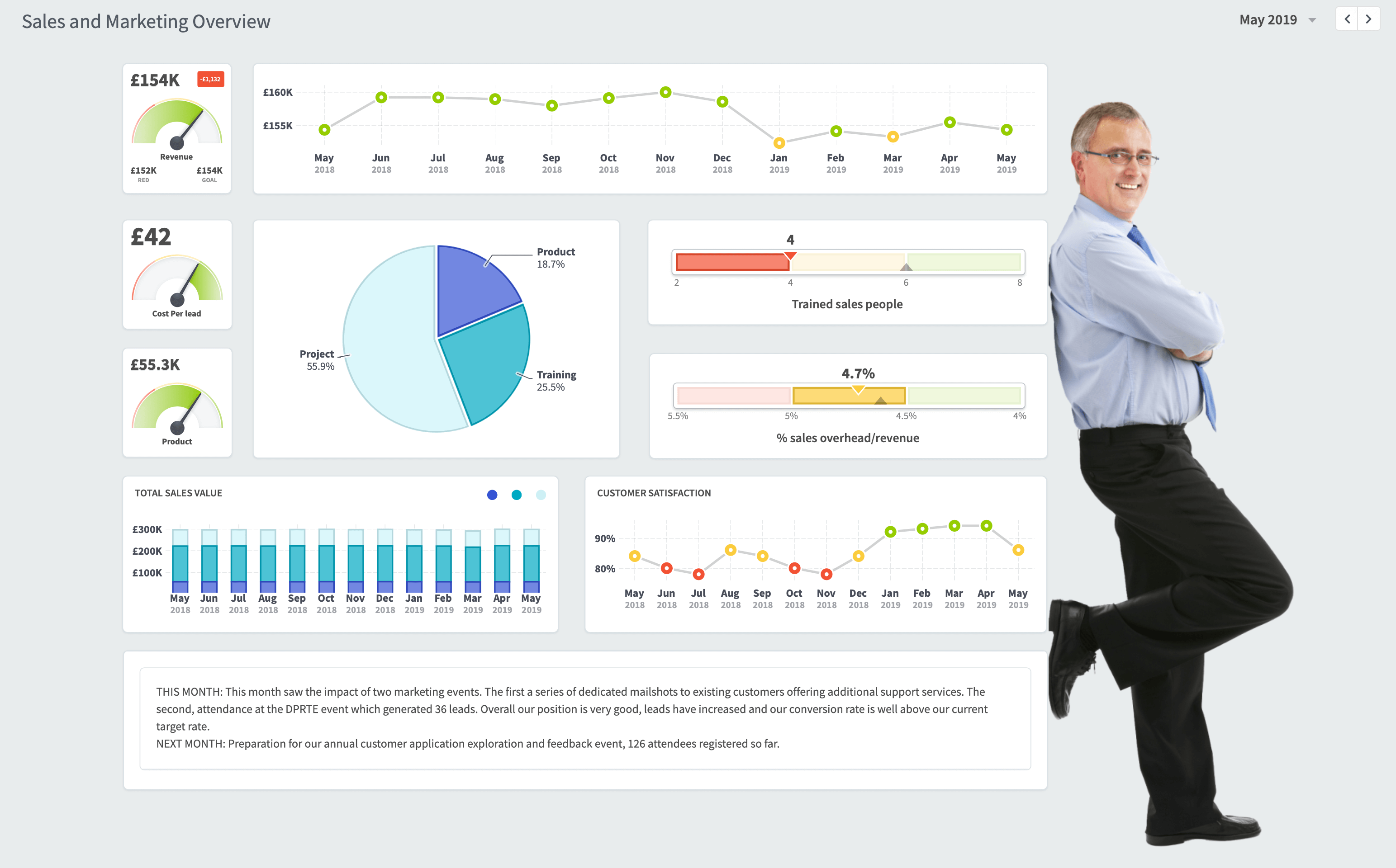
This example looks at a Sales and Marketing Overview