Interpreting KPI Results
Welcome to the fourth article in our series on Key Performance Indicators, or KPIs. This week we are going to focus on interpreting KPI results. Once the hard work has been done to create and implement the right measures, how are these then interpreted?
How not to measure KPIs
Before the advent of digital KPI tracking software such as Spider Impact, organisations were often obliged to assign copious skilled resources to the production, analysis and communication of KPIs. Reports were time-consuming to produce and would frequently contain errors, requiring onerous re-work. Being paper-based, there was no immediate way to provide additional real-time data for further questioning. For those organisations that are not yet using a performance management software tool, this situation may still be a reality!
KPI measurement best practices
So what does good measurement practice look like for KPIs? Regardless of organisation type or industry, these requirements will always apply:
A process and structure
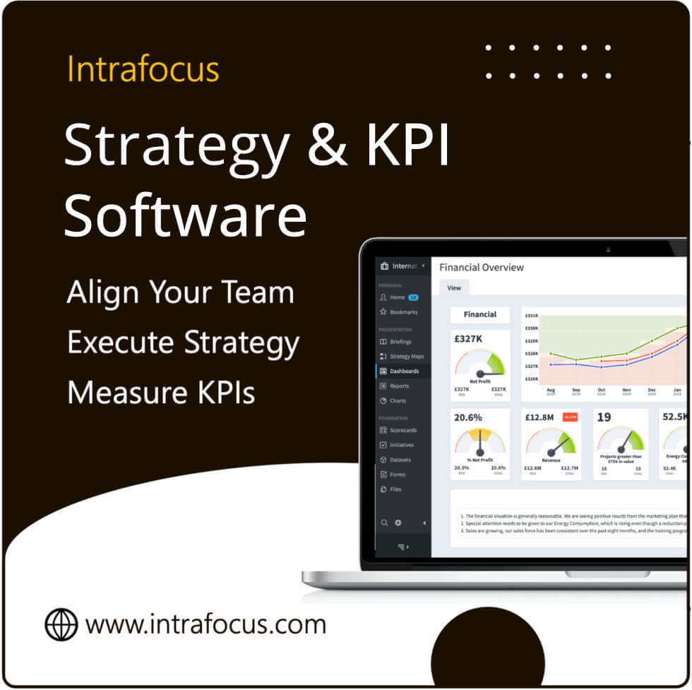
Commit to a regular schedule of KPI report production and communication. Use a business performance software reporting tool such as Spider Impact to support your Balanced Scorecard framework and to easily produce rich and customisable dashboards with real-time data that users can interrogate and view in a way that best matches their visual and learning style. Clarify the process for discussion of KPIs and the action of any remedial steps.
Benchmarking
Always look at historical data and analyse it within your broader organisational context, pulling in knowledge and experience from your business leaders who can provide insight and valuable interpretation to round out objective figures.
The right approach
Avoid knee-jerk reactions if a single measure suddenly dips into the red. Remember we discussed the danger of the ‘blame culture’ in an earlier article. Don’t make the mistake of panicking and going into finger-pointing mode! Instead, take a calm and objective approach to investigate why the KPI has fallen outside of its tolerance level. Identify the drivers of the change and then agree on remedial measures. This may require a change to processes, management, systems or structures. Provide the support, help, budget and time needed to make these measures and provide reassurance, communication and encouragement to the team/s delivering those changes. Remember that it is vital to maintain a high degree of motivation and morale to ensure that teams remain engaged and bought-in to achieving the KPIs.
Focusing on clarity versus quantity
Remember that the purpose of providing KPI results is to provide data for analysis and effective decision-making, especially if remedial courses of action need to be taken to close a shortfall between desired and actual performance. So focus on the clarity and quality of the information provided. Where a KPI is in a shortfall, provide any known explanation or context within the regular management report. Don’t overwhelm the reader with unnecessary or superfluous information, simply because it exists. This can always be made available in an appendix for those who appreciate rich detail. Remember different learning styles and preferences for information and data and err on the side of brevity with a focus on information relevance and value.
How long should a KPI report be?
Keep the KPI report as brief as you can without losing vital data. The dashboard approach provides an easily-digestible and visual means of absorbing complex data and allows users to drill down to particular areas of interest without becoming overwhelmed. It is useful to provide some high-level commentary to accompany the KPI set as a whole, but this should be succinct. For managers that want or need additional information, Spider Impact allows the interrogation of data for further analysis.
What is an XmR Chart?
Businesses may also want to use more advanced tools to measure and interpret KPI progress, such as XmR charts. These ‘moving range’ charts provide a linked pair of control diagrams that measure a process with a single subgroup size. The charts are used to determine whether the business process or KPI being measured is improving over time and provide a clear view of those changes. The axis compares an individual, or X, with a range of individual measures mapped against an MR, or Moving Range, which tracks the variability between data points. These charts can be produced in traditional spreadsheet packages, but their complexity makes this approach extremely time-consuming. It is far more expedient – and accurate – to use an automated software package to make their production instantaneous and simple.
Keen to find out more about Spider Impact? Please contact the team at Intrafocus.


