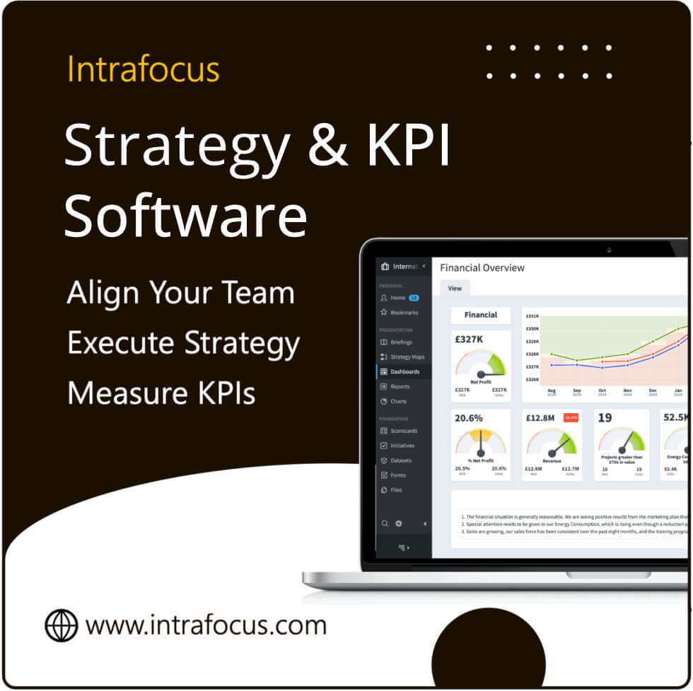

KPI Dashboards – When businesses begin their strategic planning journeys, motivation is high and everyone wants to see results as soon as possible. So it’s natural that there’s going to be a lot of enthusiasm for your KPI dashboard. After all, that vital piece of documentation is going to evidence just how successful the business strategy is proving to be, and whether everyone’s hard work is paying off.
The pressure to produce an all-singing, all-dancing KPI dashboard will be high – but it makes sense to take a breath and proceed slowly.
What makes a great KPI dashboard?
Yes, KPIs must be measured according to your business cycle, and this may mean working within a short timeframe. But it’s important to create a KPI dashboard that will satisfy the criteria for success. Great dashboards are:
- Simple and easy to read, with clear visuals
- Designed to share key performance indicators and key business performance data – ideally in one screen
- Designed to offer in-display media that responds to varied user needs
- Easy to navigate – quickly
- Easy to drill down to find further detail as required by business area or KPI
- Contextually clear, using a benchmarking system such as RAG keys
- Visually consistent and simple, without overuse of colours, flashing widgets or clutter!
What are typical mistakes when building a KPI dashboard?
1. Trying to keep everyone happy
It’s absolutely impossible when every stakeholder will have their own interests, objectives and data presentation preferences! Work with target user groups instead to gather specific needs, and reassure everyone that the dashboard can evolve over time with feedback.
2. Keeping a ‘big-picture focus’
When your management meeting ends up discussing widget colours and designs, you know you’ve lost the necessary focus! Focus on the message of the KPI dashboard and the strategic drivers. Can you explain what the dashboard is there to achieve, who its end users are and what their needs are? If so, you are probably on to a winner! Remember that the essence of great design lies in simplicity, and proceed accordingly…
3. Keeping design clean
Everyone’s a back-seat designer where presentation is involved! But your dashboard isn’t an art project – it’s a visual representation of key strategic information to aid decision-making. Use a RAG system for colour guidance and link any additional colours to your brand. Keep everything uncluttered and clean, using Spider Impact for simple, high-quality and ready-made widgets which you can simply drag and drop into place.
4. Keeping content focused
Remember your target user groups and their documented, defined needs? Revisit these and strip out any ‘fluff’ from your dashboard. Additional data can also sit at a department or supplementary level for those who need it.
5. Managing input
Never ask your business customers how they want your KPI dashboard to look. Remind them to focus on the problems that they are trying to solve with the data being presented inv the dashboard. As the creator of the dashboard, it is within your remit to find the best graphical representation. This can easily be adjusted over time.
6. Adding context
A good dashboard will have the context that is useful to stakeholders – such as comparator figures against last year’s performance, or competitor data.
7. Alerts!
Don’t overdo the RAG system. Too many alerts look terrifying! Define the acceptable performance levels for a KPI in the system and use your RAG code accordingly. If actions aren’t required (or available) then you don’t need to add visual alerts.
Handling KPI dashboard challenges
A good way to handle these challenges is to approach your business’s dashboard as an iterative process that will evolve over time. Use automated software that makes it extremely quick, easy and intuitive to create a dashboard and to develop it as you receive feedback.
Automated systems also pull in data from the source, avoiding errors and time-wasting and they allow data to be updated in real-time. What’s more, they naturally simplify complex sets of business information and provide it in layers so that readers can drill down to the specific information that they want to see, in a way that they want to see it.
Let your stakeholders know that the overall business dashboard is there to measure your ‘true’ organisational-wide KPIs – but that department-wide dashboard can also be created. Keep educating your audience and train them in how to use the system for early buy-in and support. The more you can engage your end-users and demonstrate the value of automation, simplicity and focus, the better your results will be.
The help you need
The team of strategy experts at Intrafocus are there to help you create the best possible KPI dashboards as part of your business strategy journey. In the first instance, take a look at the Spider Impact page. next, view some KPI dashboard examples. Please contact us in the first instance to discuss your needs.