Together with Scorecards, Initiatives and Reports, Dashboards can be added into an Organization container. First, click on the Briefcase icon at the top-left of the screen and select an Organization into which you want to add a dashboard. You need to be an Administrator to create dashboards.
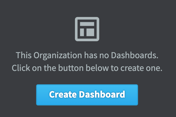
If this is the first dashboard in the Organization selected, click on the blue Create Dashboard button and miss the next step.
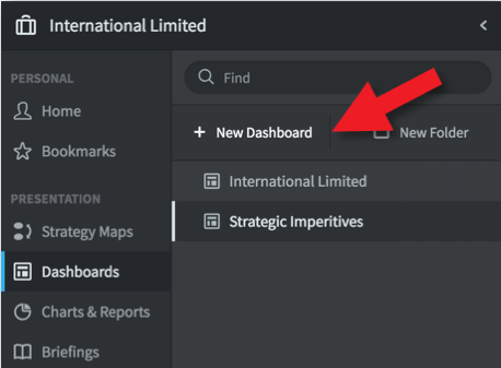
If this is not the first dashboard in the selected Organization, then click on + New Dashboard
The Create Dashboard dialogue will appear. Give the Dashboard a name and click create. This will take you into Dashboard edit mode.
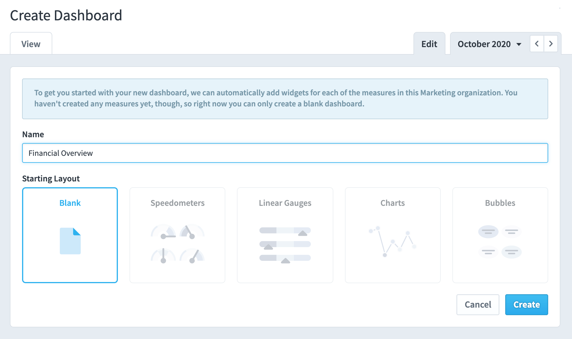
Dashboards are created by adding Widgets.
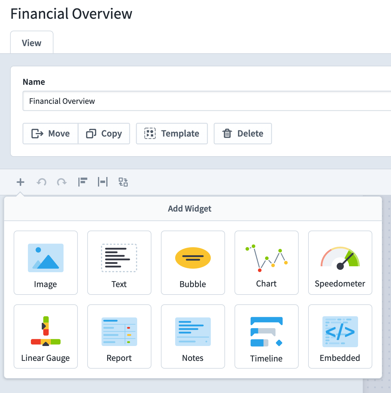
Click on the + button, the widget list will appear. You can add many different items to a Dashboard. The items you add will derive their data from other objects in the system. To see a full list, click on Bubble. For this example, we will add a Speedometer. The process used to add objects is the same for most objects.
Click on Speedometer.
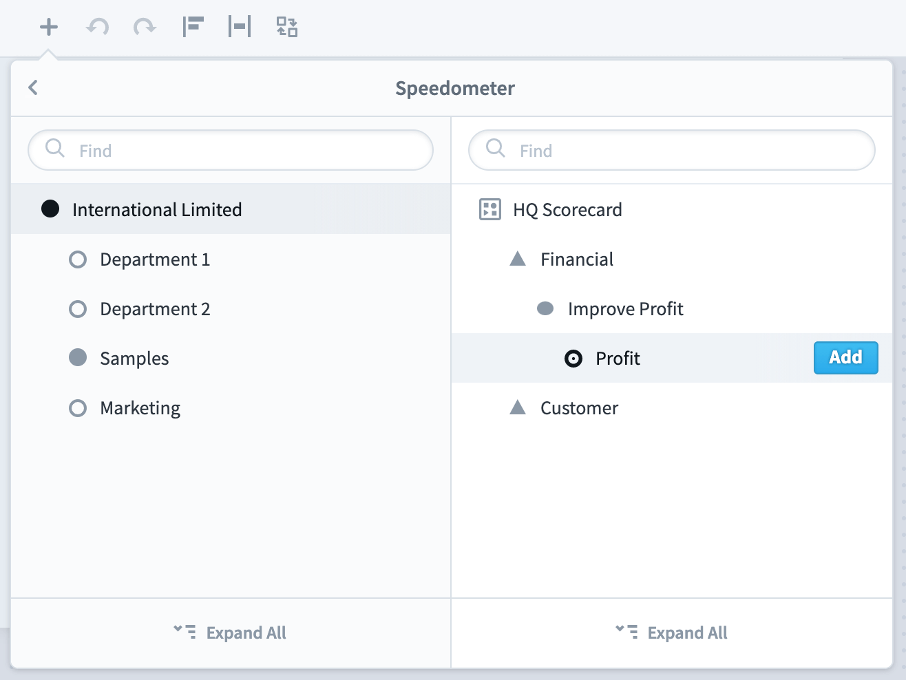
The Scorecard menu structure will appear.
Open out the Scorecard by clicking the chevrons next to the objects. Select the object you want to display. In this case, we will select Profit. Click on Add.
The dialogue box will remain open. You can Add multiple objects to save time.
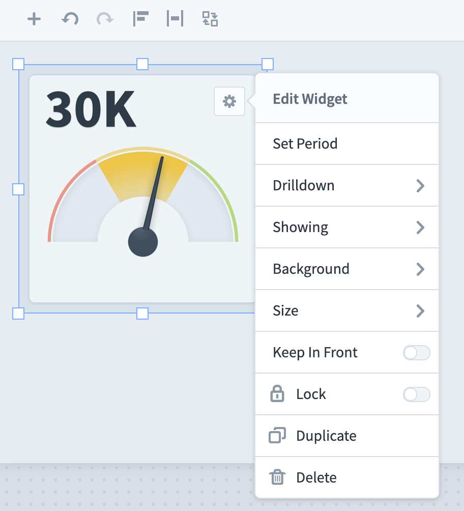
Click the + icon to close the dialogue. The speedometer has appeared. You can change its properties by clicking on the Cog icon at the top-right of the object.
You can also drag and drop the object and resize.
Important Tip: Click Save frequently when designing Dashboards, do not wait until you have completed the process!
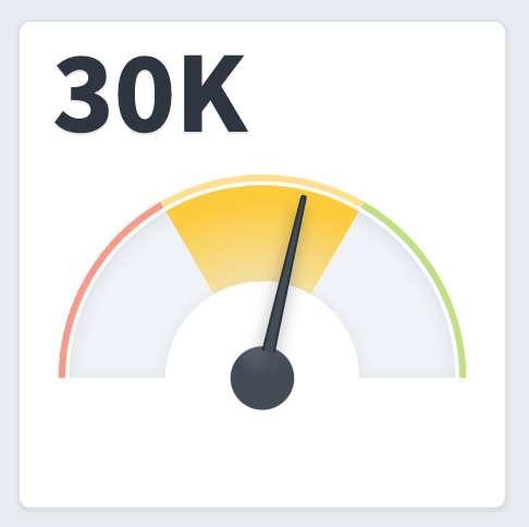
The finished object should end up looking something like this (after some actual values have been added).
Adding a Chart to a Dashboard requires a couple of extra steps. First, click on the + Icon and select Chart. You will notice that you can add charts from Scorecards and Initiatives. For this example we will select Scorecard Item:
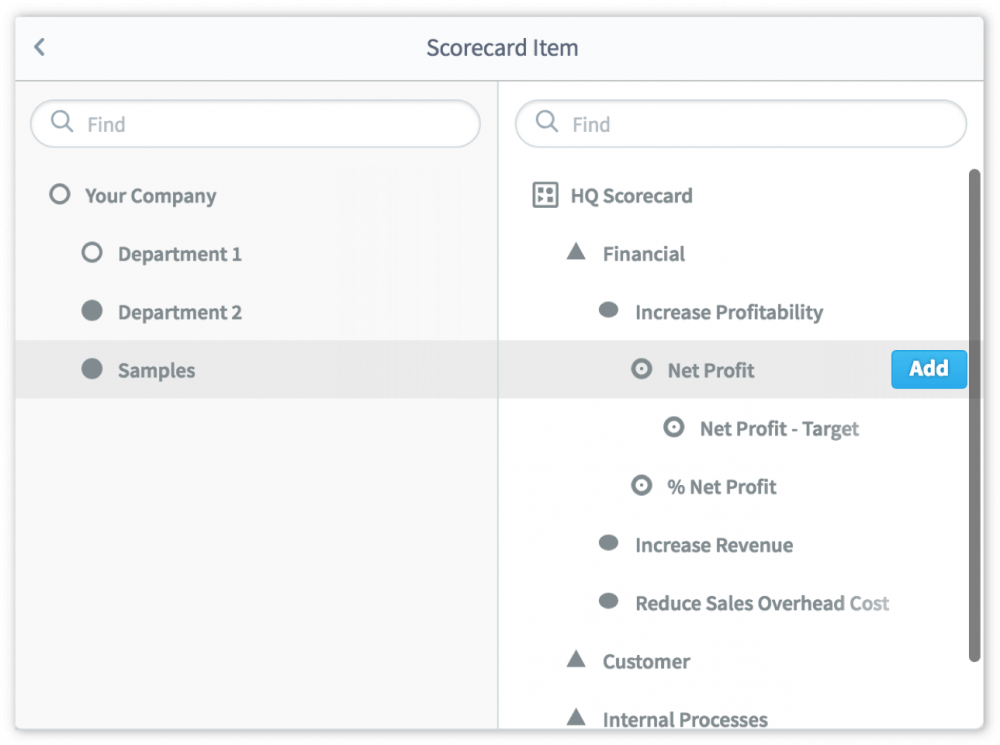
Once again we will navigate to the correct item in the Scorecard, Profit, and click on the Add button and then the + Icon to close the dialogue.
TIP: click on Full-screen to go into full-screen mode when designing dashboards.
The chart appears and as before you can move and resize it and click on the cog icon to change its properties.
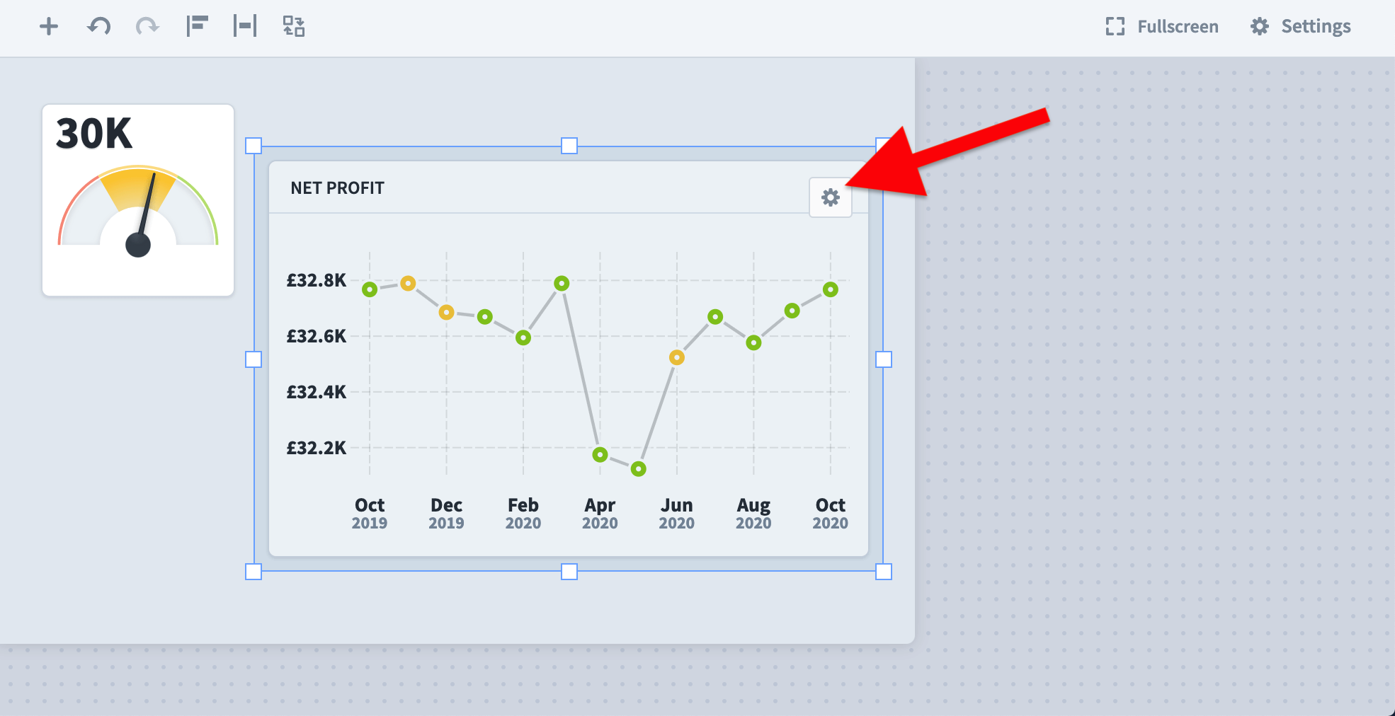
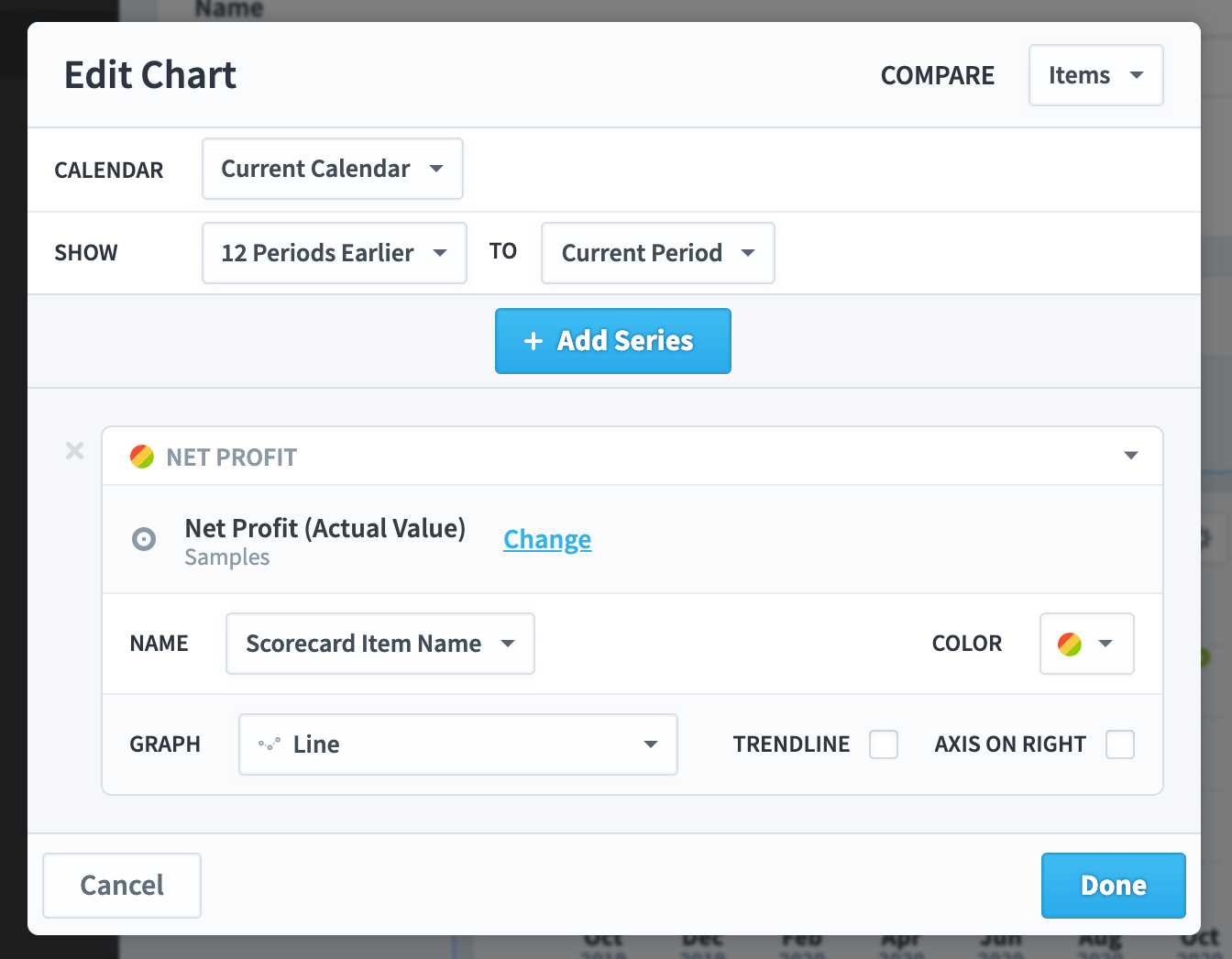
Unlike other objects, with charts, you can select Edit Chart and change a set of chart specific properties.
The Edit Chart dialogue allows you to change the calendar and dates shown, add overlay series, add a custom name, select various line, bar and pie chart types, add a trend line and a right-hand axis.
The result may be that you end up with a chart that looks like this:
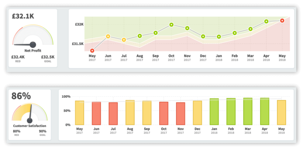
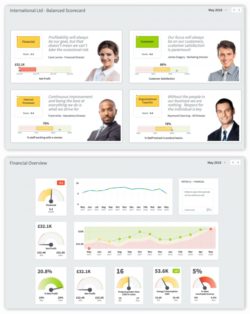
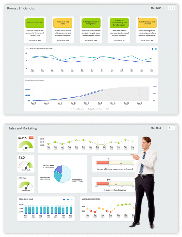
There are many types of dashboard you can create, here are some examples:
