Column Formatting
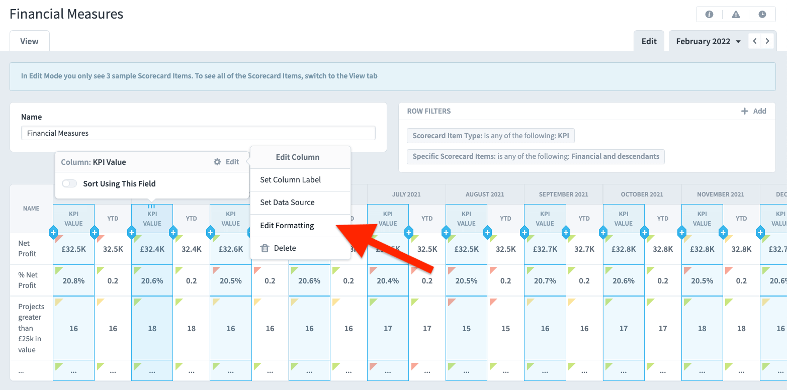
To edit a column’s formatting, choose “Edit Formatting” from the Edit tooltip.
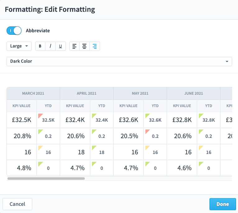
The Edit Formatting dialog gives you a preview of what your formatted data will look like. Here we’ve changed the font size to large, changed the color to dark, abbreviated the data, and aligned everything right.
Column sorting
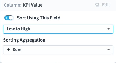
You can choose to sort on any field in your report. The default sorting for scorecard and initiative reports is first by organization, and then by tree order. You can change this default sorting by clicking on a column and turning on “Sort using this field.”
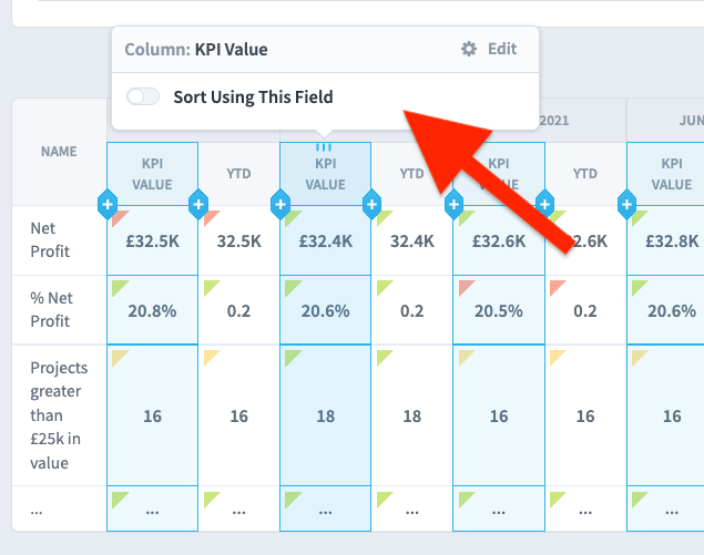
You can then choose to sort that column ascending or descending.
Grouping
You can group by a column by clicking on the column and turning on the Group switch.
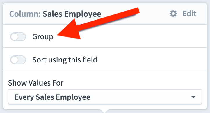
This shows all unique values for that column as large group headers, and then lists all of the records with that value underneath. In this example we’ve grouped by the Sales Employee column, so each group is a different sales employee. The Edit tab only shows the first three groups, but switching to the View tab will show the full report.
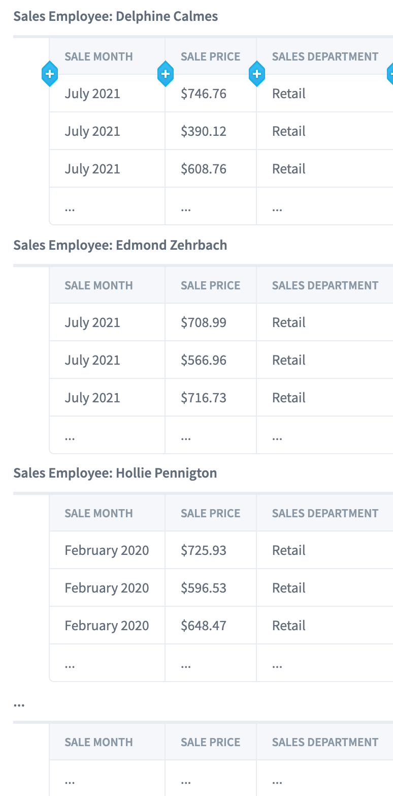
You can create another level of grouping by selecting another column and turning on “Group Again”.
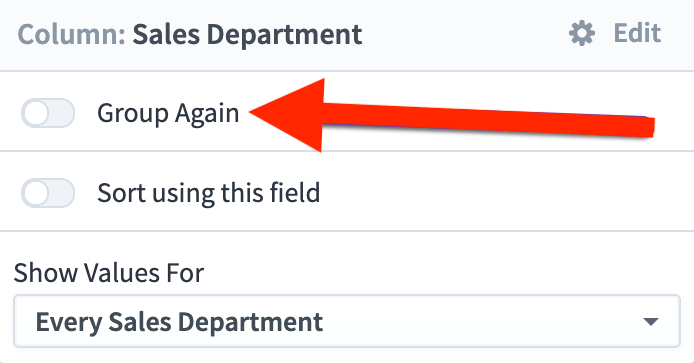
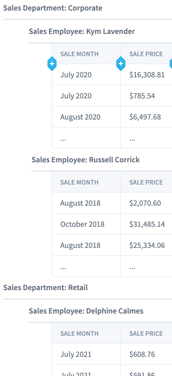
In this example the Sales Employees are also grouped by Sales Department.
Hiding individual records
Adding a group to your report opens the door to many new data presentation possibilities. The most powerful is the ability to turn off “Show Individual Records”. In this example, we’re grouping records by the Sales Employee column, and we’re showing columns for the Sale Date, Sale Price, and Sales Department.
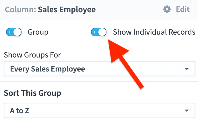
When you turn off “Show Individual Records”, the report now only shows the groups. As you can see, the columns remain the same, but now they’re showing aggregated data for each group. Number columns like Sale Price are summed by default. The default aggregation type of Date and Text columns is counting the number of unique values.
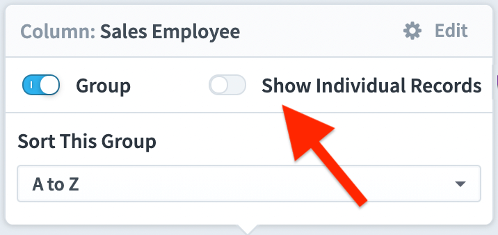
Let’s say we want to show the Average sale price for a group instead of the Sum of all sale prices. To do this, just choose Set Data Source like we did before.
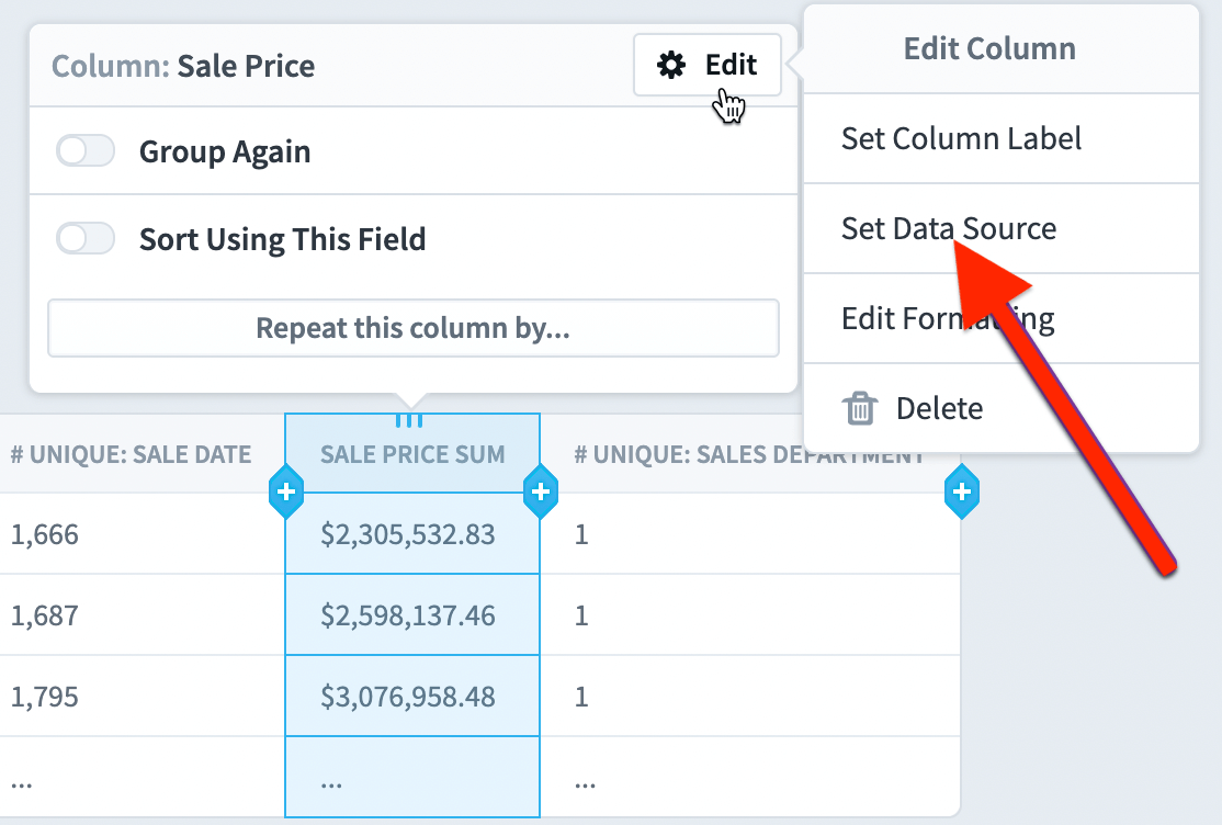
Now that we’re showing aggregated data, however, we have an Aggregation Type choice in this dialog. We’ll choose Average.
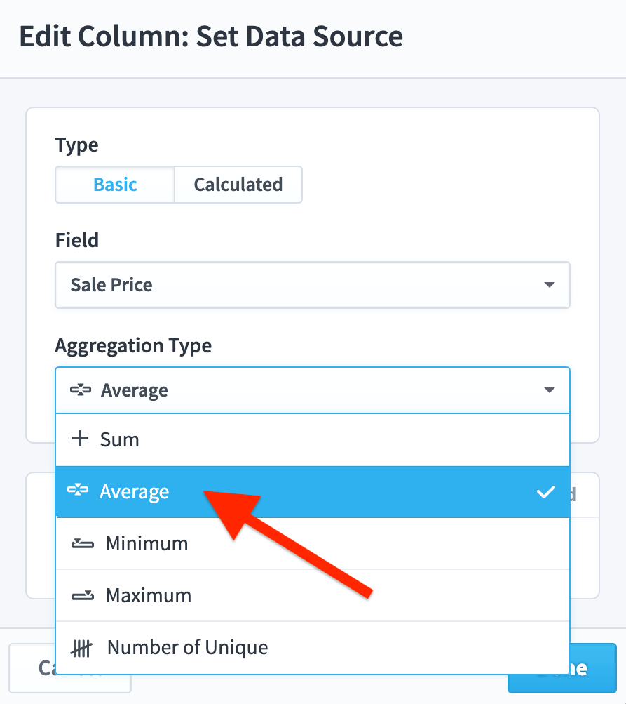
Once we click Done, we have a report showing the average sale price for each employee.

Finally, we’ll change the Sale Date aggregation type to “Latest Date”. Our finished report looks like this on the Edit Tab.

And like this on the View tab.
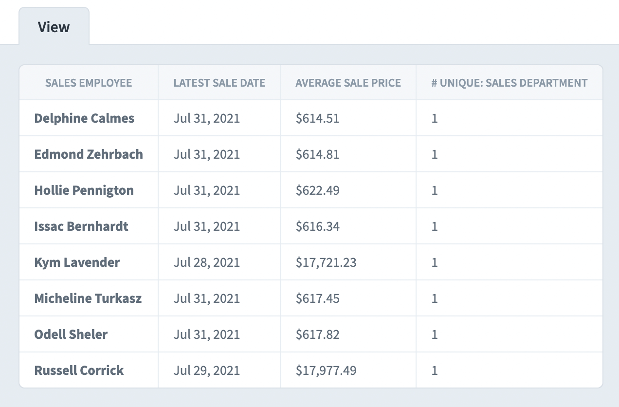
Column filters when hiding individual records
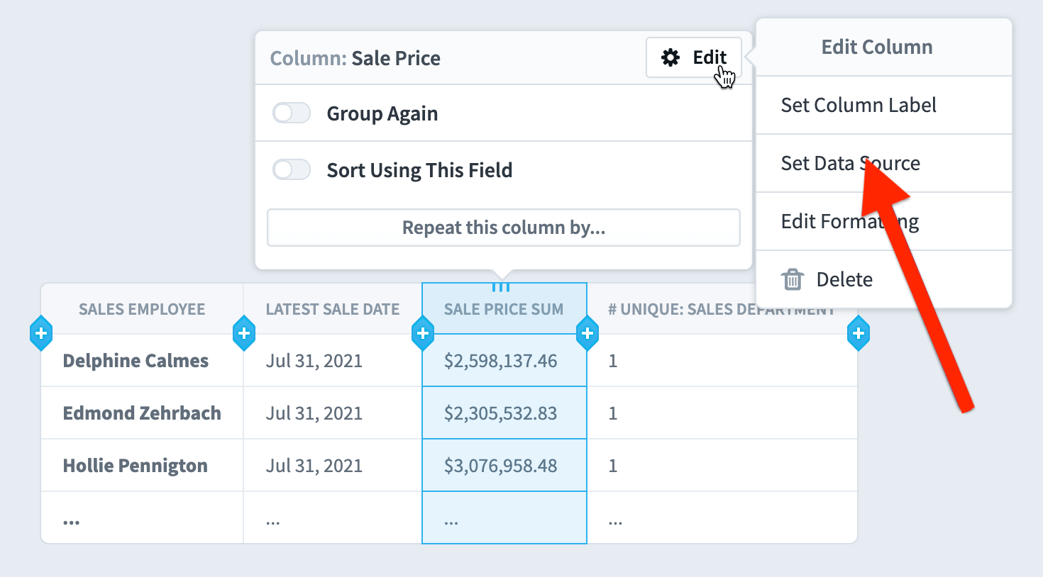
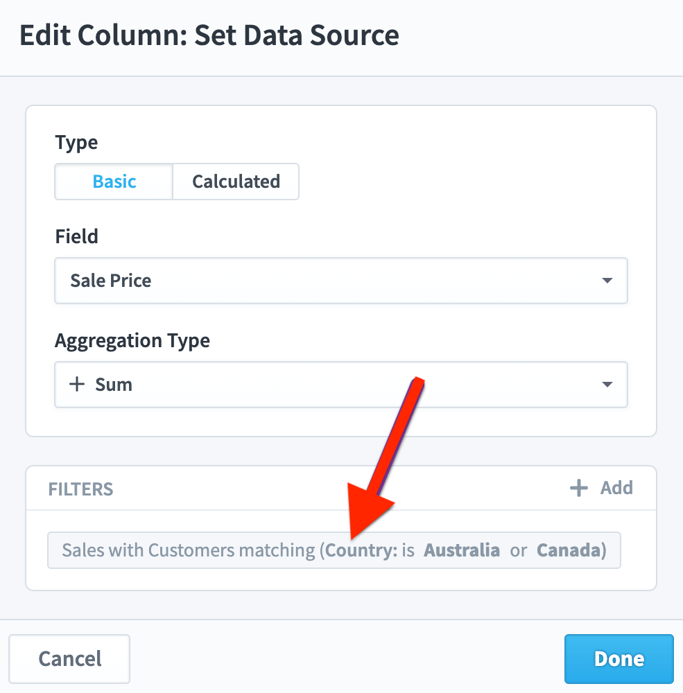
Once you’re hiding individual records and your report is showing aggregated data, you can start adding filters to your columns. In this example we’re going to choose “Set Data Source” for a Sale Price column.
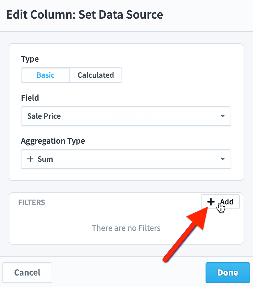
We’ll leave the aggregation type as sum and click the “Add” button in the filters panel.
Next, we’ll create a filter to only include data from records where the sales country is Canada or Australia.
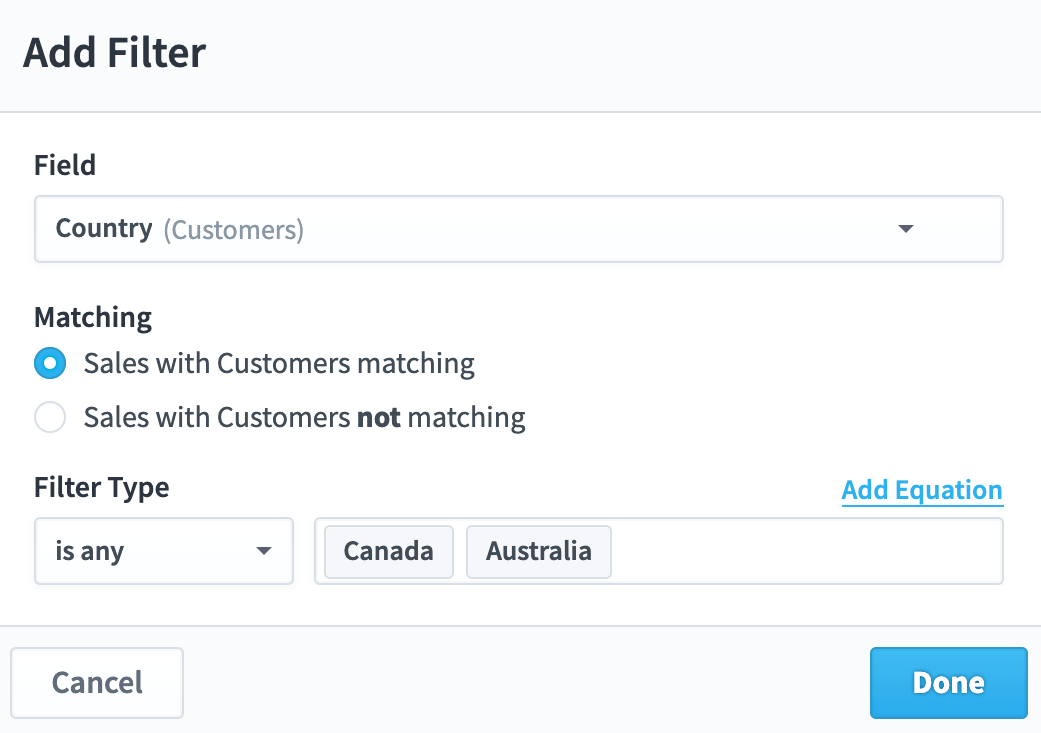
This is what our new column filter looks like.
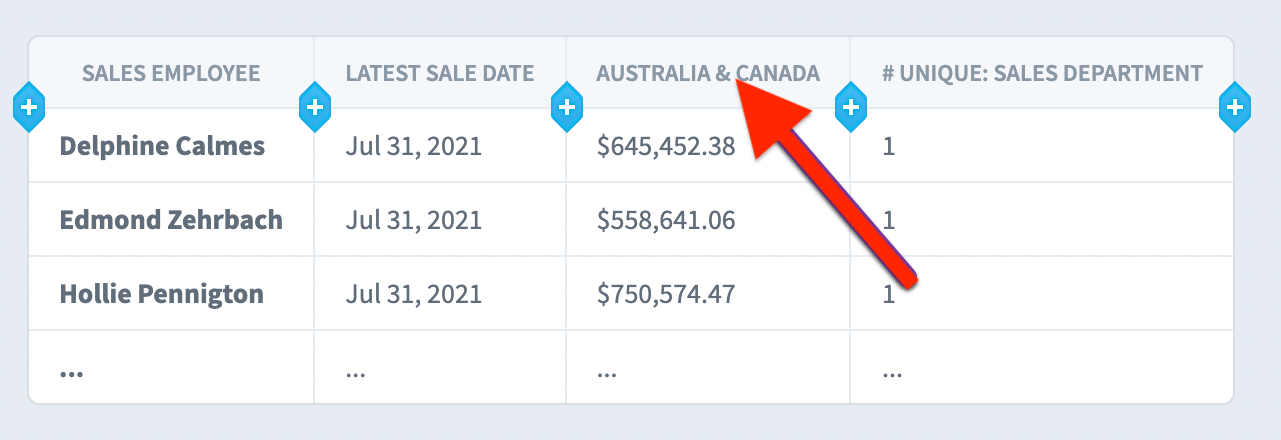
When we click Done, we now have a column showing the sum of all sales in Australia and Canada for each employee.
Repeating columns for scorecards
You can create repeating columns for Scorecards, Initiatives, and Datasets reports, but they’re a little bit different for every report type. For Scorecards, values that change over time are always inside of a repeating column. Whenever you add a column like KPI Value or Goal, you’ll automatically see that field repeating by calendar period. As you can see in this example, it doesn’t make sense to show a KPI value without knowing what period that KPI value is for.
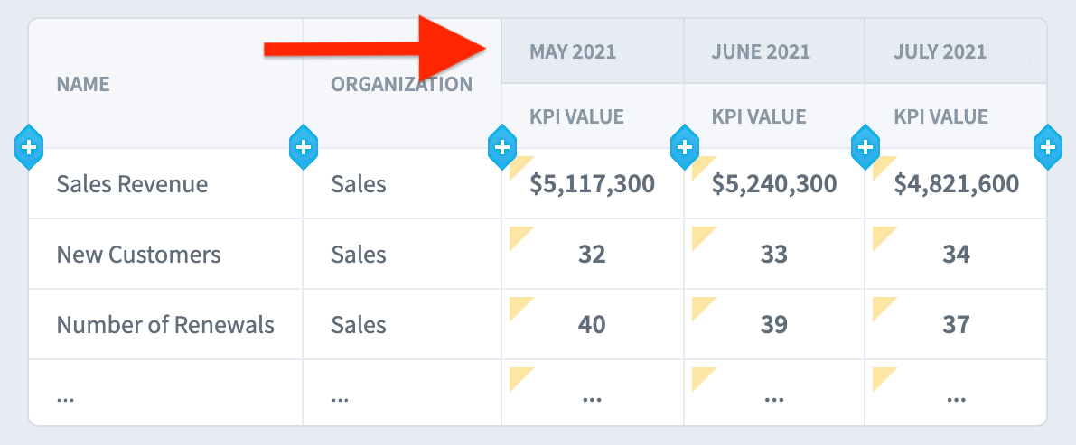
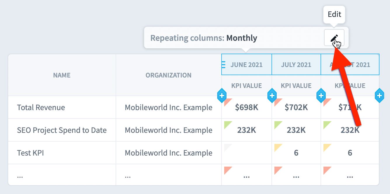
To edit repeating columns, just click on them. Just like when you select a column, selecting a repeating column header shows a tooltip. We’ll click the Edit button.
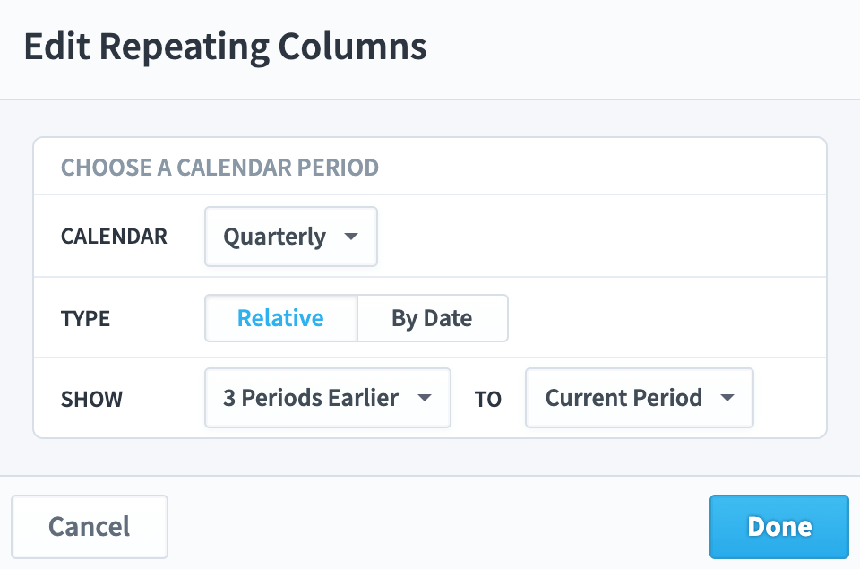
This opens the Edit Repeating Columns dialog. We’ll change the calendar to Quarterly, and we’ll choose a range of 4 periods.
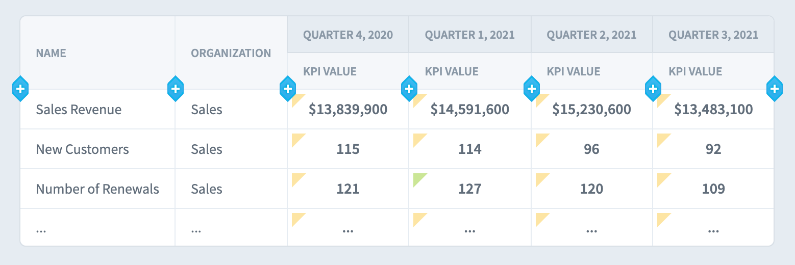
When we click Done, we now see the KPI value being repeated for four quarters.
Repeating columns for initiatives
As we mentioned above, repeating columns work a little differently for every report type. Repeating columns for Initiatives are similar to repeating columns for Scorecards because there are values like Money Spent that change over time. Initiatives are different, however, because their repeating columns aren’t required and aren’t added by default. Whenever you have a column for a field that changes over time and it’s not repeating, the report will just show the latest value.
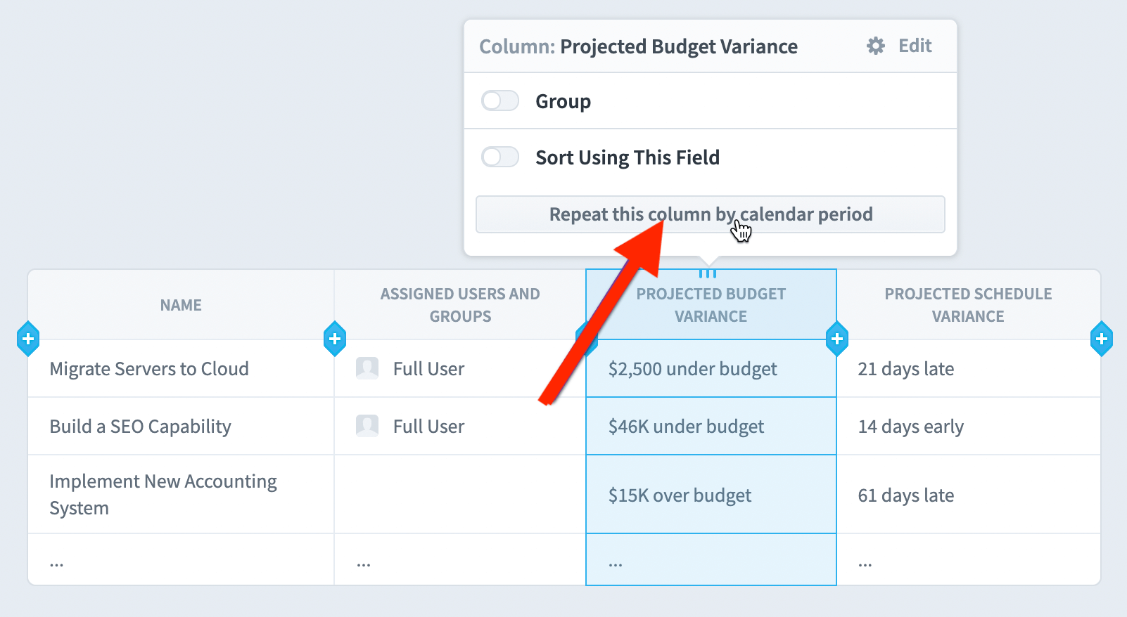
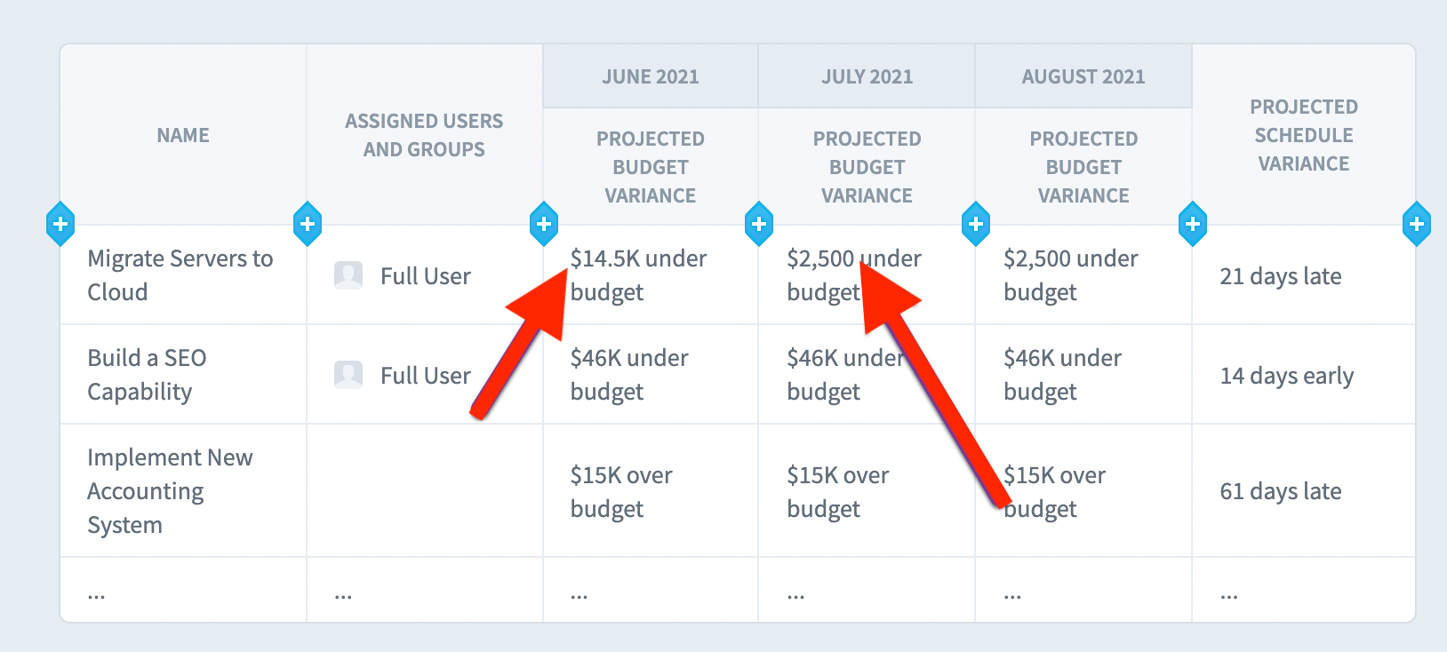
In this example we have a column showing the projected budget variance for every initiative item. The projected budget variance field does change over time, but because this column isn’t inside of a repeating column header, the report just shows the most up-to-date values for the projected budget variance. We do, however, see a “Repeat this column by calendar period” button.
When we click the button, we now have repeating columns showing how the projected budget variance has changed over time.
Repeating columns for datasets
You can only add repeating columns to dataset reports when individual records are turned off. That’s because we need to first aggregate dataset records for each group before we can disaggregate the data into repeating columns. Scorecard and Initiative reports don’t have this restriction because their repeating columns can show values that change over time.
In this example we’re grouping by Sales Employee and are hiding individual records. We now see a “Repeat this column by…” button when you click on any column other than the one you’re grouping by.
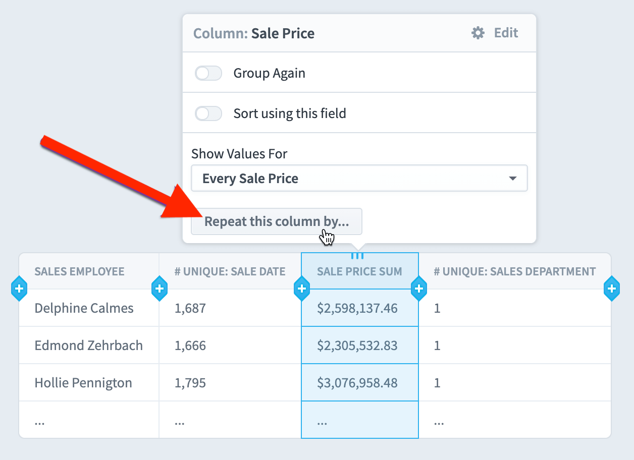
We’ll click the “Repeat this column by…” button and then choose to repeat by Country.
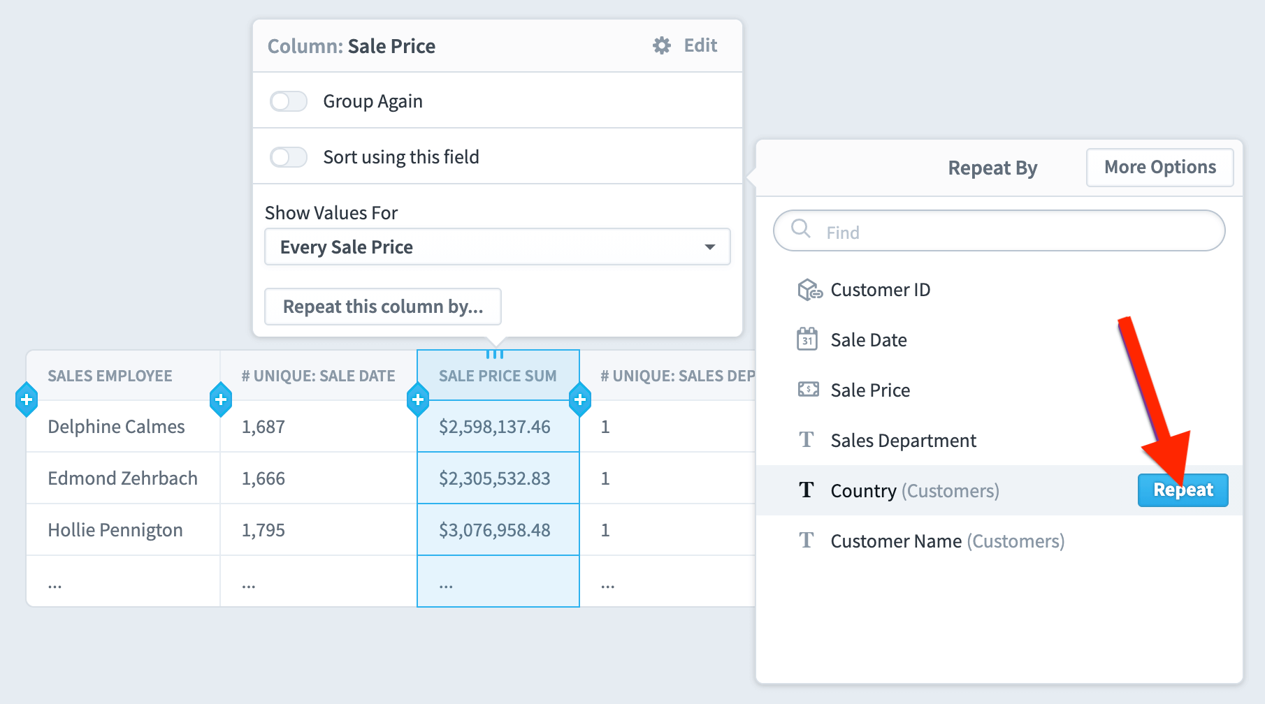
We now have a separate Sale Price column for every country.

Multiple blocks of repeating columns
You’re not limited to one range of repeating columns. In this example we’re going to add a new column outside of the first block of repeating columns.
We’ll choose to add another KPI Value column, and now we have two identical blocks of repeating columns.
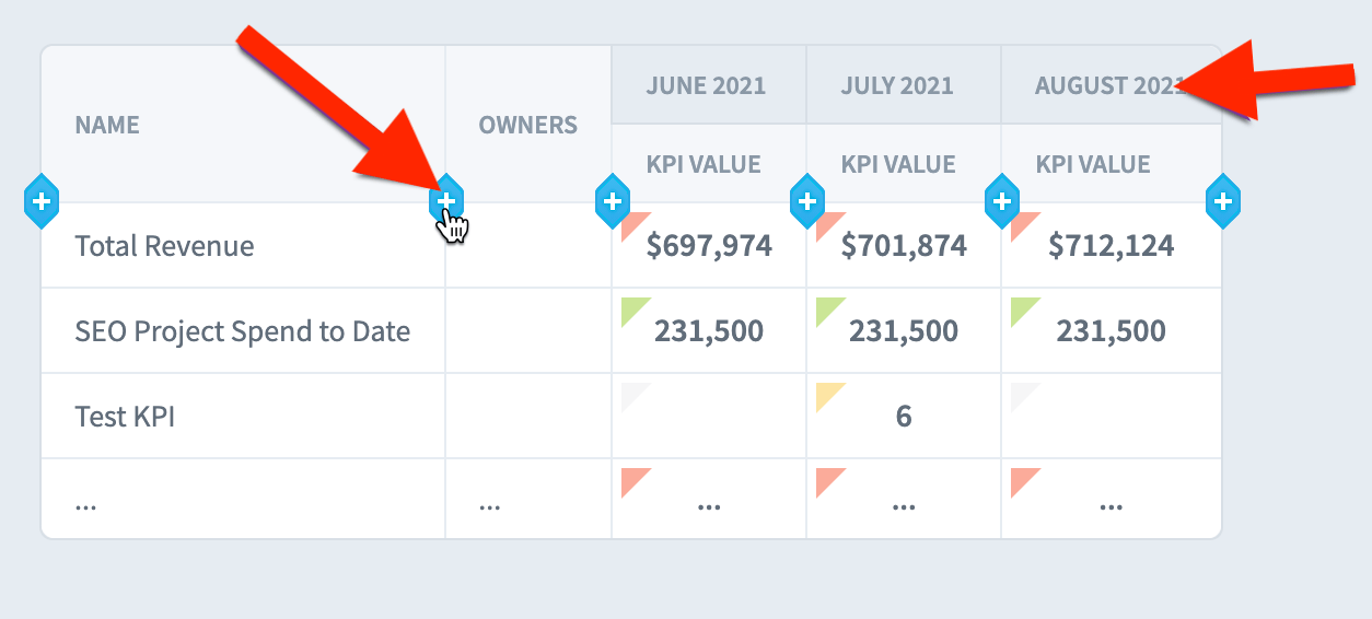

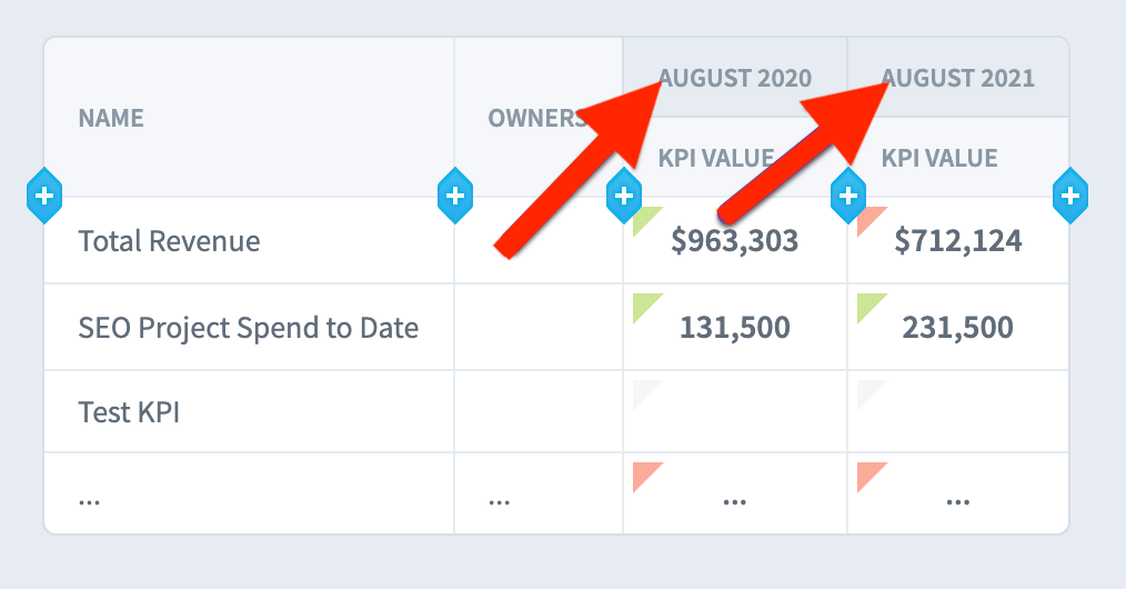
Finally, we’ll edit each repeating column block to contain a single period, and we’ll drag and drop the blocks next to each other. Now we have a report showing the KPI value for the current month and the KPI value from the month one year ago.
Repeating columns again
Scorecard, Initiative, and Dataset reports can all repeat columns a second time when individual records are turned off. For Scorecard and Initiative reports, repeating again is almost always used when multiple organizations have the same initiative or scorecard items and you want to compare them across organizations. For datasets, repeating again is common with all field types.
To repeat again, click on the repeating column header to select it.

Then click “Repeat again by” and choose a field. Here we’ll repeat by Sales Department.
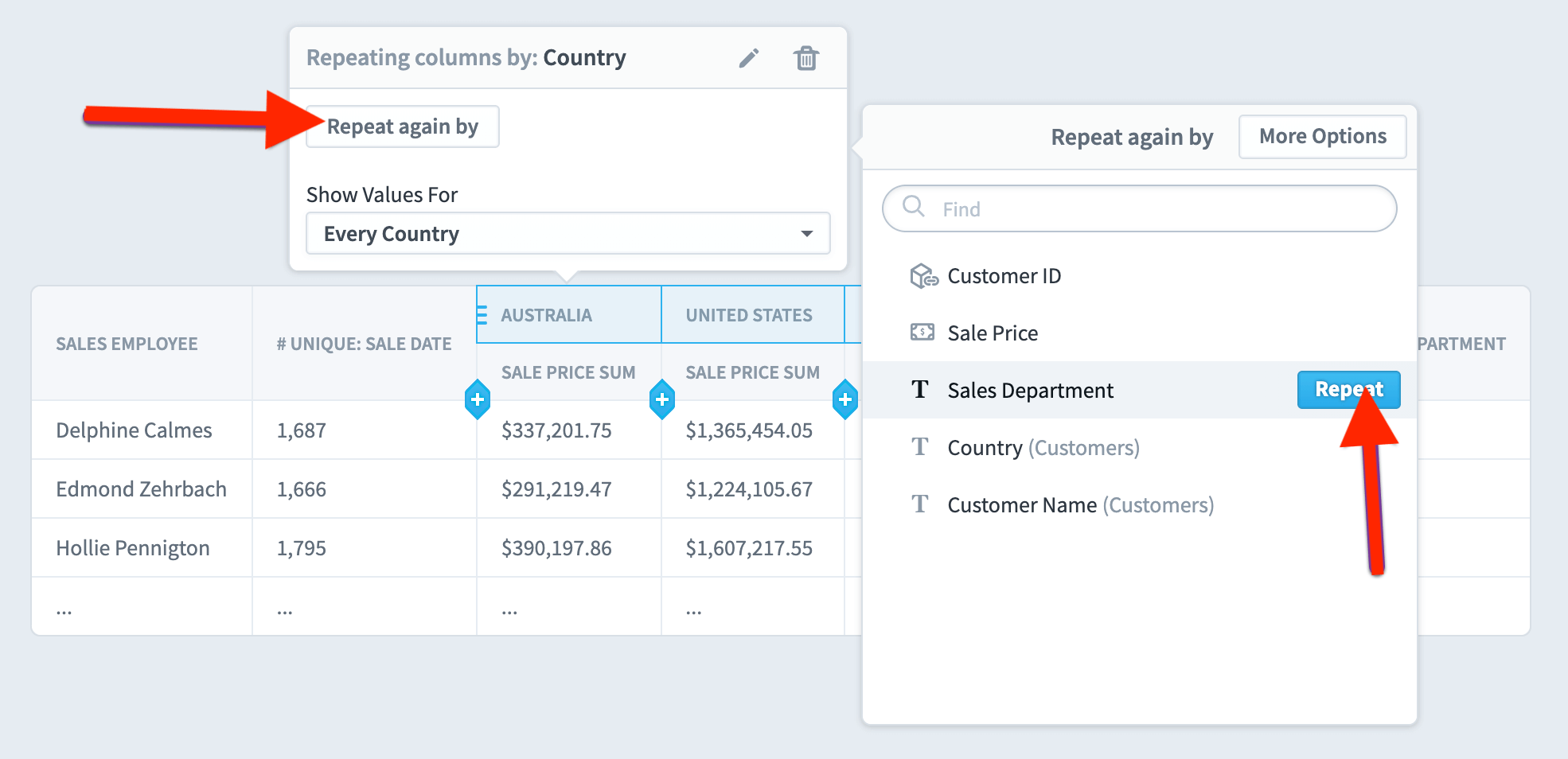
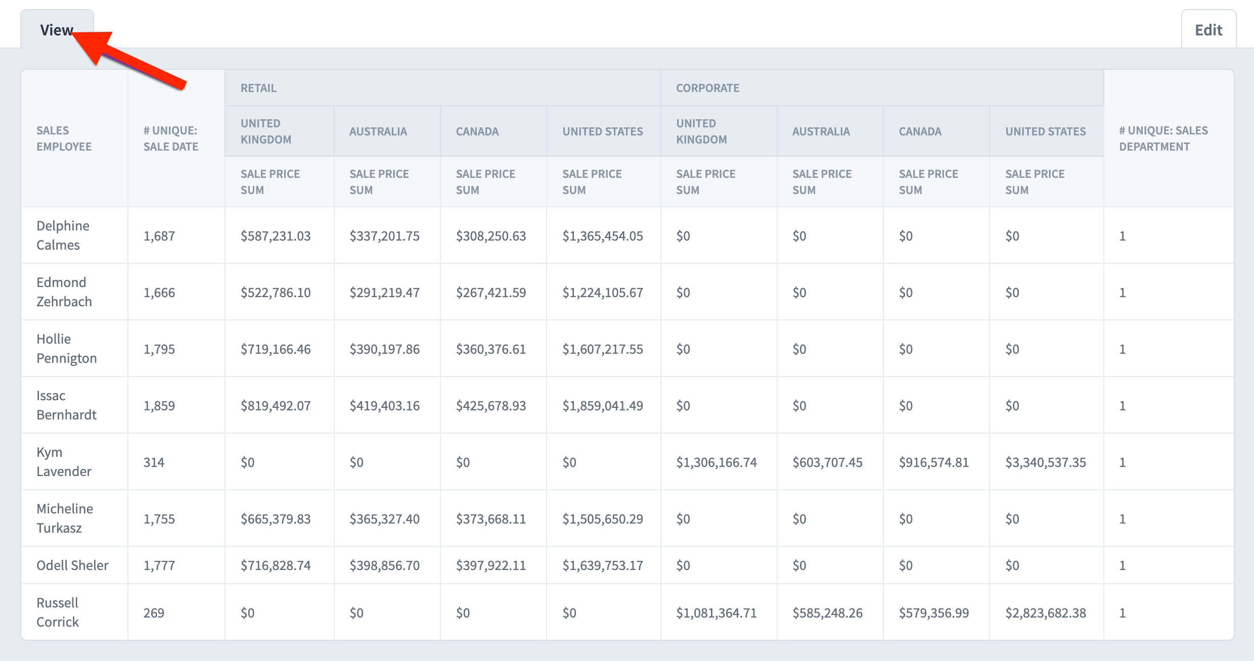
The result is a report with two levels of repeating columns, first by Sales Department and then by Country.

On the Edit tab there are all 0s for Corporate sales, but when you go to the View tab you can see that in this example employees either sell retail or corporate, never both.
Changing header order
In this example we’re showing KPI Value and Goal columns, repeating for 3 periods. The columns are on the bottom and the calendar periods are on top.

To put the columns on top, just drag and drop them vertically.

Now the report first groups by column, showing the three periods for KPI Value and then the three periods for Goal.

Hiding repeating column headers
Some reports have only one column, for example KPI Value. Other reports have only one repeating value, for example a single calendar period. In these situations, you can choose to hide either the column or the repeating value header.
For example, here we’re showing the KPI Value for three months. The KPI Value isn’t adding a lot to the report in this situation, so we’ve dragged the column header to the top.

We then select the column and turn on “Hide This Header”. On the Edit table the header now has an icon showing that it’s hidden.
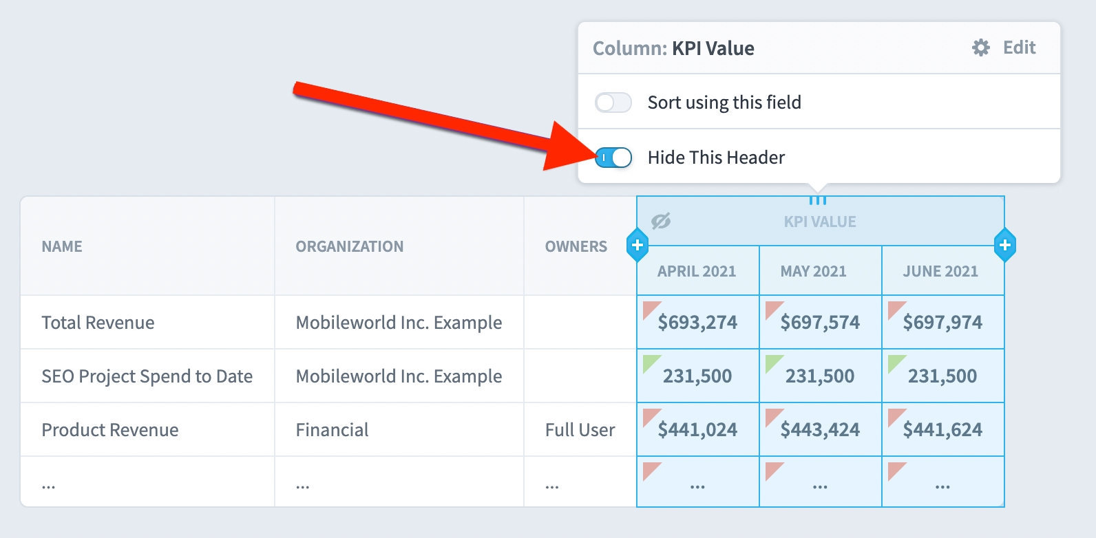
On the View tab the column header is no longer visible.
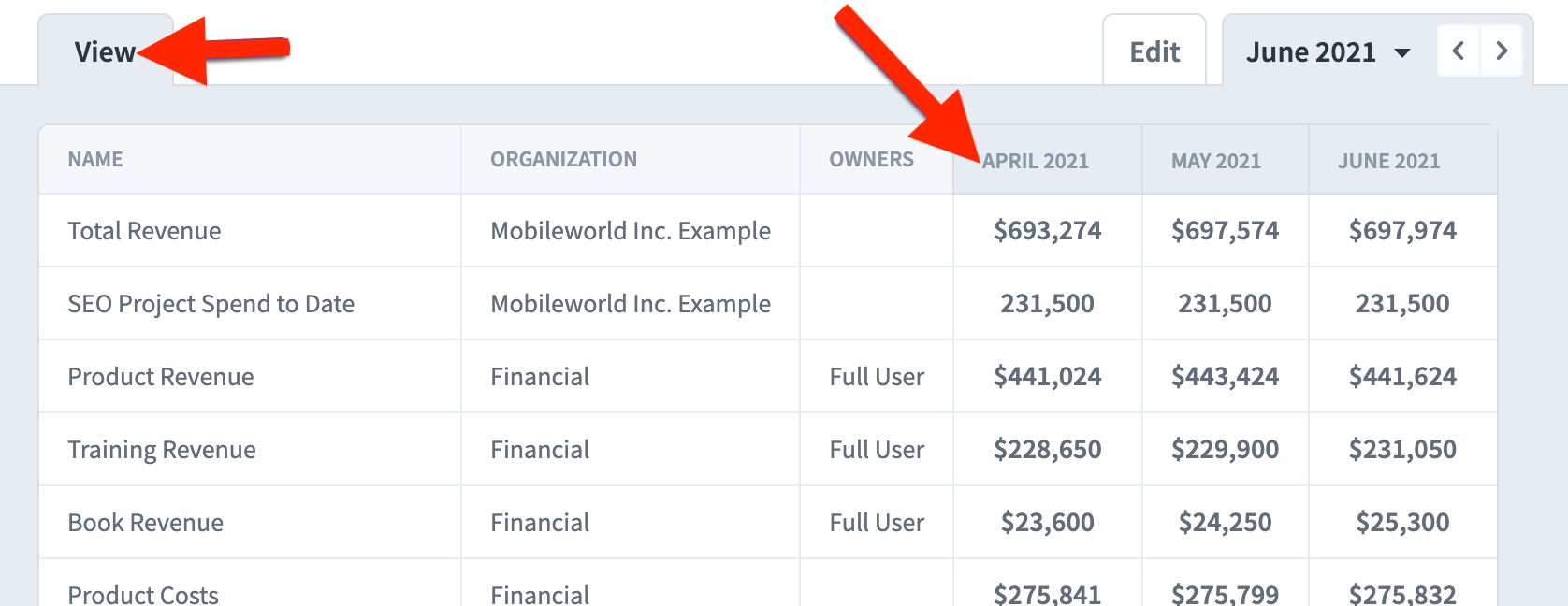
When you’re repeating again, you can even hide two levels of headers. In this example we’re showing data for a single field and for a single calendar period. We’ve chosen to hide all of the headers except the KPI name.

Notes columns
When you add a notes column to your report, there’s a “Set Note Display” option in the menu.
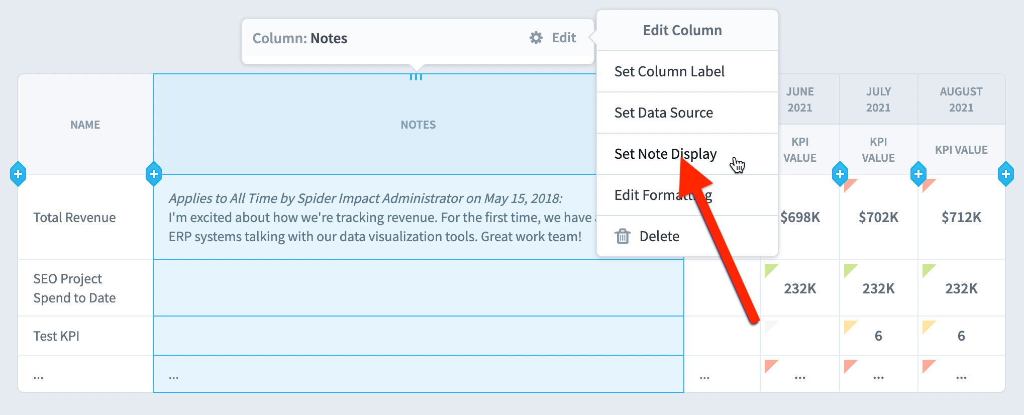
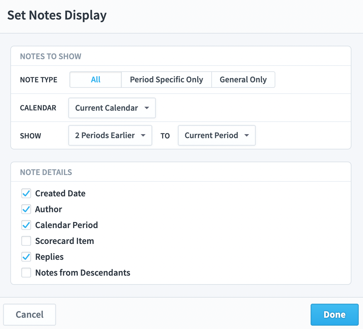
This allows you to choose not only the type of notes to show for your report, but also the information from each note you want to see.
Weight columns
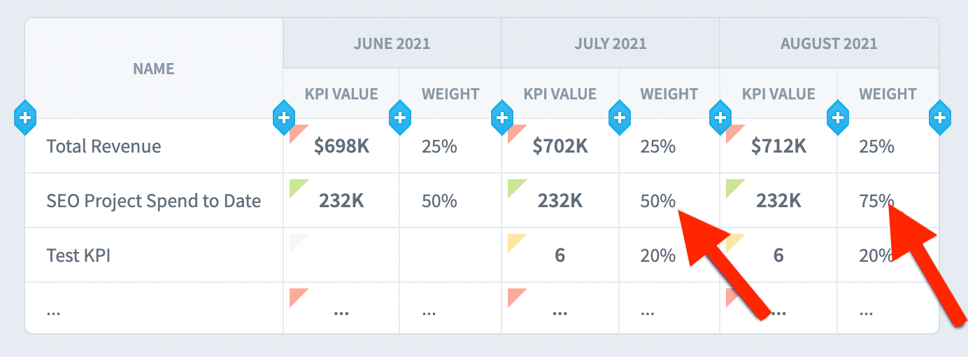
A scorecard item’s weight can change over time, but it often doesn’t. If you add a Weight column to your report, it will show the most recent weight for that item.
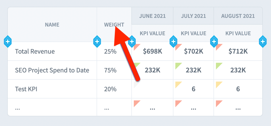
If you add a Weight column inside of repeating calendar periods, it will show what the weight was at the end of the period. In the example, the “SEO Project Spend” KPI weight changes in August.
